Categories
Oil Painting

Painting in Progress

Painting In Progress - Vege Still Life

Oil painting in progress on 16×12″ board
Click images to enlarge, select “All Sizes”

1st Layer, 1st Oil Painting

Previous first layer of same painting

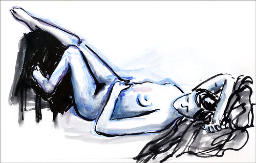
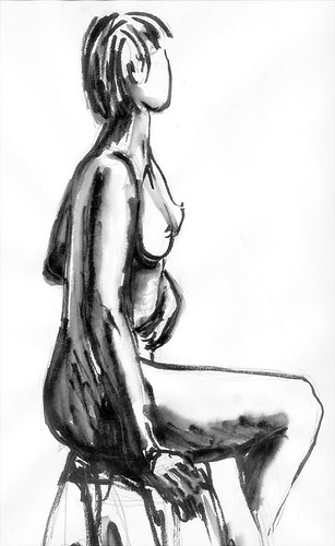
I’ve been trying to figure out how to resolve this dilema: Since I started posting daily sketches and small paintings to my blog about 8 months ago I haven’t been working on any larger paintings, preferring the immediacy of plein air painting and direct sketching and painting daily. Now I’m working on paintings that take more than one session to complete, in both watercolor and oils. On days like this when I’ve spent my art time working on a painting in progress, what do I post at the end of the day? Do I post the work in progress, an older sketchbook piece, or nothing at all? Today I decided to post what I worked on today plus the two reference photos (below) I’m combining to make the painting.

RawSaveP1010201 __ Vege still life setup 2

This painting has been my practice piece to relearn how to paint with oils. Today was a huge breakthrough. First I read an article about oil painting without using solvents that gave me some good clues and then I finally received the book I ordered, Janet Fish: Paintings. In looking her paintings and at my books of two other oil painters whose work I love,  Alice Neel and Jane Freilicher, I got inspired and  started painting. Instead of the frustration and left-brained how-to thinking that I’d been experiencing with oils I was able to just paint and enjoy the seeing deeply. That’s how it is when I’m painting with watercolors: I don’t have to think too hard, just work intuitively. Pretty exciting!!!

Categories
Block Printing Every Day Matters Watercolor

Lantern again (EDM 95) on frustrating day

New Years Lantern

Block print, printing ink & watercolor, 5×4″
(To enlarge click image, select “All Sizes”)

This week’s Everyday Matters challenge was to make a holiday card image. I thought a lantern glowing in the dark would be a good image for my cards this year. I’d carved and printed a linoleum block a few weeks ago and the ink was finally dry enough to paint with watercolor so tonight I painted three of the prints, trying to find the right combination of colors. I think this is the one.

I actually send New Years cards, not Christmas cards, since I started opting out of the winter shopping holidays over 10 years ago and celebrating the new year is more meaningful to me. Though it sometimes feels a little odd to be so out of step with the rest of the known world, it works for me, and allows me to enjoy the season without the stress.

I had such high hopes for painting and making monoprints today, but even though I got up at 6:30 it just didn’t happen. The morning flew by and then I had to go out to get framing supplies. I needed the Blick store people to cut the giganto foam core board down to size. First there were math challenges figuring out how to cut the 10 pieces I needed from the various sizes of foamcore board, then there was problems with their cutter, a missing screwdriver to change the blade, various incompetencies, long lines, etc. Two hours later, with lots of extra free foamcore board that they cut wrong and had to redo but gave me anyway, I headed to the hardware store for glass. The glass was dirty and hard to clean but finally, the framing that had to be done today was finished. Then it was time for dinner and poof the day was gone.

At least I got to noodle around adding color to the lantern. I have the afternoon tomorrow to paint and I will!

Categories
Monoprint

Persimmon Monotype #1

Persimmon 1

Akua Kolors on Arches 88 paper, 6×8″
To enlarge, click image, select “All Sizes”

Monotypes are really interesting to make and really confusing. I’m just barely finding my way with the process. For one thing, in order to make the final print not be a mirror image of your original drawing or photo, you trace the original and then put the tracing paper upside down under the acrylic printing plate as a template. That doesn’t seem to difficult until you also try to refer to the original drawing or photo which is now a mirror image of the one you’re working with. So if you want to see what color something is in the original, it’s all backwards. I finally solved that problem by looking at my original photo in a mirror I propped up beside it.

The other complicated part is that I was doing three printings on the same paper of yellow, blue and red — sort of like glazing in watercolor — in order to mix additional colors by layering them on the paper. First I applied yellow on the printing plate (a sheet of acrylic) where I wanted the image to end up with yellow (or green or orange after applying blue and red), and wiping it off where the image should not be yellow and then printed it. Then I did the same with the blue ink, wiping it off where I wanted the yellow to stay yellow, not become green, or where I was going to want purple later and then printed that layer. Then I did the same for the red, trying to get some oranges over the yellows, purples over the blues and dark brows for the branches by combining all three colors there. I was going to do one more layer to add some black lines but had to stop and get ready to go out for the evening.

Tomorrow I’m going to explore some more with monotype (I’ll photograph my process and post that too, which will probably be easier to understand than my explanation above). I’m also going to finally begin a full-sheet watercolor painting I’ve been meaning to get started with for way too long.

Categories
People Sketchbook Pages

Figure Drawing Group Tonight

Figure drawing group 1

Pencil in 14×17″ sketchbook

Figure Drawing Group 3

Sketched with watercolor then ink and watercolor washes added. In 9×12 Aquabee sketchbook

Figure drawing group 2

Ink (Pentel brush pen) with water added to make washes in 14×17″ sketchbook

Friday nights there’s a figure drawing group open to the public that meets on the U.C. Berkeley campus. It’s a great deal– $4.00 for 3 hours and excellent models. Our plans to go were on and off and then suddenly on again so we arrived a little late. This model really knew how to pose in interesting ways and was quite beautiful (my pictures don’t do her justice). I experimented with sketching in pencil, in ink, and watercolor with ink added afterwards. It was all fun and challenging. I saw a man there who was a regular in this same group when I used to go 20 years ago. His charcoal sketches are still phenomenal.

The whole time we were drawing we could hear people chanting, yelling and clapping nearby. I found out afterwards there was a huge pep rally going on because tomorrow is the “Big Game” between Cal (public university) and their arch rivals, Stanford (private, pricey university). When we left we saw the band playing and marching from campus up Bancroft and into a building across the street.

Categories
People Sketchbook Pages Subway drawings

Small sleepy sketches

Cafe

BART passenger

Just a couple of quick sketches today. I drew the top sketch at Peets Coffee tonight, a few minutes before they were closing. There were still three people sitting at tables and each had one foot up on extra chairs. If Peets wasn’t about to close and I wasn’t so sleepy, it would have been fun to keep drawing. It’s not much of a sketch but at least I got my pound of decaf Holiday Blend for tomorrow morning.

The bottom picture is just a guy I drew on my very late (7 PM) BART ride home from work. Coming home so late, I was really glad I’d spent yesterday evening making a huge pot of vege soup and roasting a chicken instead of in the studio. It was so nice to come home and know the soup and chicken just needed a quick trip through the microwave and dinner would be ready. Making pictures is great, but you can’t eat them, so every now and then other things just have to come first. Like maybe tomorrow I’ll get to the dust bunnies and fur balls floating around the house! (or not?)

Categories
Sketchbook Pages Still Life Watercolor

Blue Thrift Shop Bottle

Little blue thrift shop bottle

Kremer Pigments watercolors in large Moleskine watercolor notebook
(To enlarge, click images, select All Sizes)

Bottle value sketch

Quick value sketch before painting

I wanted to play with monotypes tonight but was too tired after working all day so decided to do a small watercolor sketch instead. I don’t know what this bottle held originally–nothing fancy, I’m sure. But I just love it’s proud stance, and hands-on-hips attitude. I found it at Thrift Town, a sort of thrift shop department store where I’d gone looking for a used doctor’s lab coat to wear while painting in oils to protect my clothes. They didn’t have any lab coats even though they said they did on the phone. Instead I found a soft denim old lady’s house coat in the bathrobe department which works perfectly and looks more like a traditional painter’s smock.

I used Kremer pigment watercolors for this painting even though I knew they weren’t quite the right choice. My regular Winsor Newton cobalt and ultramarine blues would have been more appropriately transparent and glowing, but I went with the more opaque and sedimentary (or is it flocculating?) Kremer pigments, just to see what would happen. They’re fun to work with and after several layers of glazes, gave the background an interesting texture. The Moleskine paper was pooping out though, starting to pill and dissolve so it was time to stop messing around and go to bed.

Categories
Oil Painting

More color studies

Color-Study-Secondaries

Secondary colors and their darkened, neutralized (grayed) cast shadows in oil

Color-Study-Primaries

Primary colors and their darkened, neutralized (grayed) cast shadows in oil

I’d hoped to have more to post tonight than these 8×10 color studies, but nothing else is finished. Also, the colors don’t look quite right on screen–the paintings’ backgrounds are brighter and not so mustardy or greyed looking. [If you want to know more about the process for mixing the colors for the cast shadows click on Comments where I describe it in response to Toni’s question.]

The 5-day weekend that had stretched out so luxuriously ahead of me a few days ago is gone now, and I barely accomplished half of what I’d hoped to do in the studio. But I’ve also done some really important things that I’d been slacking on the past few months, like sleeping, eating properly and exercising AND I spent hours in the studio every day, making progress and enjoying the process.

Now it’s time to clean oil paint off of a dozen brushes and then head off to bed so I get another good night’s sleep then back to the office tomorrow.

Categories
Animals Plein Air Sketchbook Pages Watercolor

At the Dog Park

Watercolor and Micron Pigma Brush Pen in Raffine 6″x9″ Sketchbook

Yesterday I’d planned to spend the day in the studio but it was such a surprisingly nice day that I decided to go sketch at the dog park which is only about a mile from my house. Pt. Isabelle is a 23 acre park where dogs are allowed off leash and can run, swim and play. It’s on the S. F. Bay with stunning views of the Golden Gate Bridge. I sat on a bench along the path and watched the passing parade of canines and their owners. One very large dog turned out to be a miniature horse, the size of a Great Dane, and she caused quite a stir. I overheard her owner telling the gathering crowd that they take her places in their mini-van and that she sleeps outdoors but comes in the house and hangs out with the family. That brought back fond memories of my favorite childhood book, Pippi Longstocking, whose horse lived with her indoors.

Every dog that passed by took a turn peeing on the post beside my bench but none would hold still long enough for me to draw them. I filled several pages with partial dogs and then switched to doggie stick figures, just trying to capture their gestures and shapes. It was a hoot eavesdropping on the conversations I heard with owners and their dogs: “Now, Isis, I told you not to do that…stop it now Isis or else you’ll be sorry when you get home, Isis, stay, no, stay, I told you to stay….” It reminded me of the Far Side cartoon that goes:

What you say: Oh Ginger, that was a bad thing. You’re a bad, bad dog, Ginger.
What a dog hears: Blah Ginger, blah blah blah. Blah blah blah blah, Ginger.

After I’d finished the second picture it got really windy and foggy so I headed home, happy to be in the studio having enjoyed what may have been the last nice day before winter hit. Today it rained all day.

Categories
Animals Illustration Friday

Illustration Friday: Invention

Invention

Drawn and painted using Painter digital tools.
To enlarge, click image, select “All Sizes”
This week’s Illustration Friday cue is “Invention.”

I visited the nearby Point Isabelle dog park to sketch today and noticed that everybody had these ball-flinging and picking-up devices. This wonderful invention allows people to exercise their dogs without having to get any exercise themselves. They don’t have to run or walk with their dogs, bend down to pick up the ball, or use any energy throwing it. All they have to do is drive to the dog park, get out and fling the ball while the dog runs around.

Aside from not getting exercise, it’s actually a pretty cool invention, especially for people whose dogs slobber all over the ball, or for people like me who throw the ball so that it hits the ground a few feet away.

I’ll post my ink and watercolor paintings from the park tomorrow.

Categories
Oil Painting

Color studies in oil

I’ve been doing color and oil painting studies today from a new, terrific and appropriately named book: “The Oil Painting Course You’ve Always Wanted” by Kathleen Lochen Staiger. Unlike all the other oil painting books I’d found that had ugly paintings and sloppy instructions, this new book breaks it down from the most basic level to advanced in a logical and systematic way. Incorporated throughout is excellent information on drawing, values and color theory, and how they apply in the real world to making art with any medium. I thought I knew a fair amount about these things, but I’m amazed how much I learned today. I’m excited about working through the entire book.

I explain the purpose of the exercises below each. My apologies if it’s all boring.

(To enlarge images, click on them and select “All Sizes”)

Neutralize

(Above) Making greyed (neutralized) versions of colors without changing their value by mixing in the complimentary* (explanation below) color which has first been adjusted to the same value as the original.

Greys-Shadows

(Above) Top half: Mixing blacks and greys by combining dark complimentary* colors (a mixed black will be richer and more interesting than a black straight out of the tube).
Bottom half:
Mixing shadow colors by first darkening the color and then adding it’s compliment* which has been matched to the same value (on the right of each swatch).
Lighten-darken

(Above) Darkening colors by adding a darker pigment of the same hue (adding Burnt Sienna to darken orange; Yellow Ochre to darken yellow)
(Below) Experimenting with various brush techniques.

Brush-work

*Complimentary Colors: Complimentary colors are opposite each other on the color wheel and any two complimentary colors will contain all three primaries. Red, yellow and blue are the three primary colors. For example, orange is mixed from the primary colors red and yellow so orange’s compliment (the primary missing to complete the triad) is blue (red+yellow+blue=all 3 primary colors) which is found opposite orange on the color wheel. Green is mixed from yellow and blue so its compliment is red. Violet is made of red and blue so it’s compliment is yellow. Since pairs of complimentary colors contain all three primaries, mixing them together results in a grey color.