Categories
People Sketchbook Pages Watercolor

Another portrait sketch request

Aileen1

Brown ink and watercolor in Moleskine large watercolor notebook
To enlarge, click images, select All Sizes

A few days after I posted the drawing of Dane I received an email from Aileen, the beautiful woman in the photo below, who sent me her photo and asked me to draw her too.

Aileen-A

I planned to do a quick sketch of her today as a warm up before doing some “real” painting (I put that in quotes because it’s silly of me to think that one kind of drawing or painting is more “real” than another). But instead of it being a warm up I spent all of my painting time today working on sketches of her.

I drew the first one at the top quickly in ink and then painted it. The drawing was goofy so I decided to do it again, using pencil and eraser, still working in my large Moleskine watercolor notebook and came up with the this one:

Aileen2

I wasn’t happy with the way the ultramarine blue I used in the shadows looked and the drawing still wasn’t quite right so I did it again, this time using the last page in my Moleskine notebook:

Aileen3

In this one I did a fairly dark pencil drawing first, planning to leave it mostly as a pencil drawing, just adding just a little paint, but I got carried away and forgot my plan.

The funny thing is now that I’m done, I like the very first one I did the best. It may not look like her, but it was the most fun to do and is the most Jana of all of them.

Which do you prefer and why?

Categories
Life in general Other Art Blogs I Read

Who Needs Paint Anyway?

I was looking for videos of painting with oils on the web when I came across this crazy video. I don’t usually post stuff like this, but I just loved watching this guy quickly paint a portrait using nothing but ketchup and fries from McDonalds. Since I spent the day with my friend Richard while he tuned up my aging computer and then had pizza and a movie with friends tonight, my sketchbook has nothing worth showing so I thought I’d share this video instead.

Categories
Sketchbook Pages

Berkeley Rose Garden

Berkeley Rose Garden

Ink & watercolor in large Moleskine watercolor notebook
To enlarge, click image, select All Sizes

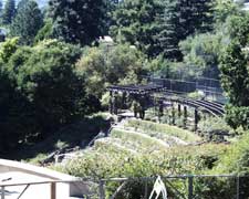
After I drew the stinky flowers I walked up the hill to the Berkeley Rose Garden. None of the rose are blooming but the surrounding trees and bushes were lovely shades of gold and red and green. I sat on a wall above the amphitheater drawing with my back to a little patio facing the street. When I arrived there was just another man and I enjoying the view and the sun. Then teenagers started arriving just like a flock of crows, one than another than a gaggle of girls…until there were 30 or more teens yelling and laughing and boasting and mostly, posing. Trying to show off for each other about how they were going to party and drink beer. I finally turned around and could see they were all nice middle class kids, probably middle-schoolers trying to be oh so grown up.

Here’s a photo from the Rose Garden’s website of the scene I painted from a slightly different angle.

rosepics.jpg

Categories
Flower Art Glass Still Life Watercolor

Quick Camelia

Camelia

Watercolor on Arches paper, 7.5″ x 10″
To enlarge click image, select All Sizes

Tonight was painting group and it was late by the time we got around to painting (after looking at each other’s paintings from the past week and random chatting). I snipped a camelia off my bush and had an idea of a loose flower with ink over it using some new colors I got from Daniel Smith. Except the colors were recommended at the workshop I attended in February for creating textured backgrounds, not for delicate flowers (oops…Strike One).

While I was painting I got really interested in the glass bowl and completely overworked the flower (StrikeTwo). The colors were muddy (they would have been fine for an old textured wall though) so I started adding white goauche mixed with pink to get back the lights and made a mess (Strike Three, you’re out!) (Please pardon the baseball metaphor.)

I decided to wash off the flower and try again. With a small sponge and clean water I wiped off all the pigment that would come off, used my hair dryer to dry it and quickly and more loosely repainted. It’s cheerier now. Since I scanned the sketch before I painted, I can easily print out the sketch on another piece of watercolor paper and paint it again even brighter without having to redraw it (although the drawing was actually a lot of fun) except for straightening out the bowl a bit since I was working fast and didn’t notice it was a little off.

Here’s the original before the flower got washed off:

Camelia

(Ick)

Categories
Art theory Drawing Faces Other Art Blogs I Read People Photos Portrait Sketchbook Pages Watercolor

Painting vs Preparing to Paint (& Portrait Request)

Fake Dane's Portrait

Brown Micron Pigma ink and watercolor in large Moleskine Watercolor notebook
To enlarge, click images, select All Sizes

The other day I got a mysterious email from someone calling himself “Fake Dane.” He wrote, “Hey, I think your art is great. I was wondering if you’d be willing to sketch me from a picture. I’m assembling a collection that I’d post. Dane”

And he sent me his photo. If you want to draw him too, just click the photo below and select All Sizes when you get to Flickr and then you can print it out:

Fake Dane's Photo

I wrote back, “Sure, why not?” and did the sketch above. I was going for caricature so I hope he’s not offended. (UPDATE: He replied and said he really liked it and put it on his blog. There’s some funny drawings of him as a vampire there too.) If you want to do a drawing of him and send it to him too, there’s instructions in the “Please Read” sidebar on his blog.

It was a fun, quick painting project on a day in the studio that was mostly spent at the computer, trying to sort out photos and compositions for upcoming paintings, something I don’t particularly enjoy doing. And that made me think about the differences between…

Alla Prima/Plein Air vs carefully planned painting

When I’m planning a painting I consider focus, value, composition, color scheme, etc. I do thumbnails and value sketches. If it’s something requiring exact proportions, such as a portrait of someone’s child, pet or home, I’ll start with a drawing and then work from a photo, tracing it onto the watercolor paper. But even with more carefree subjects like flowers and still life or landscapes, that prep work saves a lot of frustration once painting is underway. I’ve learned that lesson the hard way.

On the other hand, my understanding is that people who regularly paint alla prima (in one setting) or plein air make the prep work quick and intuitive and let go of exactitude, painting their impression of the subject rather than a careful rendering. I’ve done some and it’s a lot harder than people like Kris Shanks, Nel Jansen, Ed Terpening, and others whose blogs I enjoy visiting, make it look.

What I’m trying to figure out is how to combine the two approaches, or how to avoid all the labored pre-planning. Judy Morris, the teacher of the workshop I took in February, said that her favorite part is planning and composing from photos, not the actual painting. For me it’s the opposite — while I enjoy drawing, I love painting more and don’t really enjoy spending a lot of time photoshopping compositions and sorting through photos at the computer. (She does the prep work manually, working with black and white photocopies and enlargements of the subject and background, which she cuts out and assembles.
On the other hand, if I don’t do the pre-planning (especially with watercolor) the whole painting ends up being a study that has to be done over. I guess with acrylics and to some extent oils, one can just keep working on and changing a piece until it’s right, but I’m not sure if that’s a great way to go either.

I’m hoping to find my own way of working that incorporates the best of both worlds.

Categories
Flower Art Plants Sketchbook Pages Watercolor

Black Lilly (aka Devil’s Tongue or Snake Palm)

Black Lilly sketch

Ink and watercolor in large Moleskine watercolor notebook sketched on site
(Click image to enlarge, select “All Sizes”)

These are some weird plants. We spotted them yesterday on a walk and I couldn’t stop and sketch so I took some photos (see end of post). They look like calla lillies except the part that’s normally white and yellow is nearly black and velvety with bright green stalks. Last night I worked on some thumbnail sketches, trying to make sense of the jumble of leaves and flowers so that I could make a painting of the plant.

Black-Lilly-thumbnail

Preliminary pencil thumbnail/value study from last night

But I realized I needed more information in order to understand them well enough to paint them. So today, instead of going to the Sketchcrawl in Berkeley, I drove back up to the North Berkeley hills. I found the house and it looked like nobody was home so I set up my little stool in the driveway and started drawing. I was painting when a woman approached me and said, “May I ask what you’re doing?”

“Painting a picture,” I said, holding up the picture to show her. “Is this your house?”

“No, I live next door and I’m trying to get my house out of foreclosure. I get nervous when I see someone studying my house.” (I was sitting facing her house.) She left me alone after telling me the homeowners were away for the weekend but that she shouldn’t be telling me that.

I love the way working outdoors incorporates all the senses. There’s a park nearby and I could hear kids playing soccer and neighbors discussing plumbing and babies, and the whole time I sat there I kept smelling something like fermenting grapes. With the rich purple of the plant, I imagined it was the scent of the flowers, but probably it was coming from a hidden compost bin.

Black Lilly photo

Here’s a photo of the plant. The pink color is a figment of my camera’s imagination but I like it. The flowers actually range from black cherry to black like the one in the foreground with wonderful variations in spring green foliage. I can’t wait to get started on the painting!

UPDATE: I finally found out what this plant is: Dracunculus vulgaris or dragon arum:

“The purplish-red spathe and foul-smelling stench of dragon arum (Dracunculus vulgaris) attracts flies to the base of its erect, flower-bearing spadix. Although it is colorful, this is probably NOT the flower to give to that special someone in a bouquet.”

Categories
Acrylic Painting Gardening Other Art Blogs I Read Outdoors/Landscape Photos

An Artful Life

I’m doing something different today, inspired by a visit to my best friend Barbara’s house today — I’m sharing some of her wonderful artwork and photos of her garden. She truly lives an artful life and every corner of her little house and garden has something to delight the eye and spirit.

Images can be enlarged by clicking them and selecting “All Sizes”

Left: Life size ceramic woman (celebrating retirement and gardening). Right: View from the front porch. Just beyond this is the lush vegetable garden.

When Barbara retired not too long ago, she completely redesigned the tiny rental cottage beside her 3-story house in North Berkeley, sold the big house, and moved into the cottage with her husband and teenage daughter. Barbara is an amazing gardener and artist.

Above: Cottage front. Barbara created this mosaic on the foundation of the cottage using broken pottery and her handmade ceramic chickens.

Left: Barbara’s mosaic studio she built herself from recycled doors, windows and other things. Right: Path in her garden

Two pretty corners in the garden. Left: A ceramic gardening woman holding a carrot and a tall mosaic garden mirror.

Left: Whimsical ceramic whistles in Barbara’s sunny kitchen and a graceful ceramic woman in the hallway window. She started by making ceramic whistles and then learned how to make Ocarinas. I wonder if the female sculpture was inspired by our figure drawing sessions.

Two canvas painted “rugs” on the kitchen floor by the sink and fridge. I have rugs on my kitchen floor in those spots too, but they’re ugly things from the hardware store.

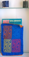
Above: Even the laundry room is artful. The detergent is hidden inside a tapestry cover.

Two of Barbara’s acrylic cactus paintings from back in the day (after she was a fabulous silversmith making exquisite silver jewelry when we first met, but before she became a teacher). During her years as a teacher she stopped painting and focused her art on quilting. Now she’s painting on her ceramics and plans to start painting on canvas again too.

I’m looking forward to some time painting in her garden. It’s about as close to heaven as you can get in Berkeley, especially when it comes with her homemade lemonade!

All art copyright 2007 by Barbara Edwards.

Categories
Acrylic Painting Art theory Flower Art

How to Overwork a Painting

I started this attempt at acrylic painting with a lovely bouquet of flowers and a plan to be free and easy, working from life but also from my imagination. I covered the canvas with a loose wash of orange and red and purple paint. Then I sketched in the flowers using a brush with thinned violet paint. Next I blocked in the colors and shapes of the flowers and the background with fairly thin paint. So far so good…nice and loose. Here’s what it looked like at that point:

Bouquet start

Acrylic on canvas, 12×16″ I wish I stopped here

I was happy. It was free and loose and going pretty well. Then I had to go back to work, so I missed a few days. When I returned to the painting I completely forgot about my plans for loose and free. I started trying to get realistic which was dumb since I’d invented some of the flowers, there was no good directional light to model the shapes of the flowers, and they were starting to smell badly and flop over. I kept working for another couple nights anyway, trying to at least cover the canvas and finish it. Here’s how it ended…

Bouquet overworked

…because I got sick of working on it (and of the smell of the gross flowers). Now it can join the pile of “learning experience” paintings I’m accumulating as I continue to try to learn to paint with oils and acrylics.

Bouquet photo

(Above) One of many useless reference photos I took but didn’t use (note how the light from above creates unpleasant shadows but no real modeling of form and no reflections in the vase).

What I learned:

  • Remember my original inspiration and stick to it (or end up with a weird hybrid creature, neither free nor realistic)
  • Take the time to get the lighting right if you want things to look three-dimensional.
  • Acrylic mediums are my friends — use them to make the paint the consistency I want because it sure isn’t right out of the tube.
  • The Stay-Wet palette will keep acrylic paint wet indefintely but will also turn it to useless colored slime. (Skip the special paper and just stick another palette inside the box atop the sponge–the paint will stay wet without absorbing water.)
  • There is no Golden Acrylic equivalents to Winsor Lemon Yellow, Alizarin Crimson, New Gamboge or Permanent Rose (mainstays of my watercolor palette) so practice mixing the colors I need with other pigments.
  • Before applying a mixed color to the canvas, test it on a piece of paper…yes you can repaint acrylics forever if you get it wrong, but why go through that?!
  • Acrylic paint dries darker because the white medium makes it look lighter until the medium dries clear…just the opposite of watercolor which dries lighter…so take that into consideration or add a little zinc white to compensate and make the color the same as it will dry.

And most important of all:

  • Lighten up, enjoy the learning process, humbling as it may be, and remember that in a year I’ll probably be much better at it (as well as a year older, so don’t rush to get there).
Categories
Oil Painting People Photos Sketchbook Pages

Woman at the museum

Museum woman

Oil on canvas board, 12 x 16″
To enlarge, click images, select All Sizes

Museum-woman2

Thumbnail sketch (1.75×2.5″) in sketchbook for painting

SFMOMA

Ink in small Moleskine notebook
(original sketch at SF Museum of Modern Art cafe)

A few weeks ago I went to see the Picasso and American Art exhibit at SFMOMA and was inspired by this woman’s thick, grey hair in a giant clip and the way the teeth of the clip separated her her hair. I also took a photo of her while I was there (below) but the view was different from my drawing so I didn’t end up referring to it when I made the painting. I’m still struggling with oils and acrylics but this one was a little easier because I stuck to black, white and 3 grays. I had intended this to be an underpainting and was going to glaze over it with the colors of eggplant and chocolate but decided to leave it because I like it the way it is.

I used Gamblin Chromatic Black for the darkest darks which is not a dead black pigment like most. From the Gamblin website: “Chromatic Black is black, but it has no black pigment in it. It is made from two perfect complements: Quinacridone Red and Phthalo Emerald.” For the grays I used Gamblin’s Portland Greys in light, medium and deep. So there was no color mixing, just a value study and an attempt to get some control with applying and blending oil paints.

IMG_0663

Categories
Outdoors/Landscape Plein Air Sketchbook Pages Watercolor

Cerrito Creek

Cerrito Creek 2

Ink & watercolor in small Moleskine watercolor notebook
To enlarge, click images, select All Sizes

Cerrito Creek 1

Today was a glorious sunny day — perfect for a mid-day walk to Peets Coffee. This is Cerrito Creek, a little urban greenway hidden away a block from Peets beside the California Orientation Center for the Blind and Albany Hill in El Cerrito. I got my coffee beans and an iced decaf latte and did these two little sketches.

It was a lovely spot except for the smell of dog pee along the fence I was using as an easel/table. This path must be a favorite dog walking spot. It’s funny how sensory experiences get embedded in a painting done outdoors — souds, wind, sun, friendly people…they’re all in there.

Tonight I tried adding a little Aquacover (a white-out designed for watercolor paper) mixed with some yellow paint to try to put back the falling water and reflections. I’m not sure it worked. Here it is before I added the splashy water.

Cerrito Creek 1