Categories
Illustration Friday Painting People Portrait Watercolor

Wedding: Illustration Friday

Matt & Margot

Watercolor, 22″ x 15″
Larger
Illustration Friday’s topic this week is Wedding. Usually when I participate in IF I create something new. I love the creative process of coming up with a concept for an illustration that is fresh, unique, and not the first thing anyone would think of (e.g. Paris = Eiffel Tower = trite). The second fun part is imagining and visualizing the image and then bringing it to life with pen and paint.

But this week I couldn’t resist posting this wedding portrait I did a couple years ago for my friends Matt and Margot, especially since this month is their anniversary and they’re expecting their first child in less than a month. Congratulations M&M!

Categories
Faces Oil Painting Other Art Blogs I Read Painting People Portrait

Francis: Work in progress, oils

Francis-Grisaille underpainting done

Grisaille underpainting, oil on canvas, 9×12 (larger)

Francis is a little boy I photographed (with his mom’s permission) in the cafe at the Museum of Modern Art in San Francisco. Something about his red hair and sweet, wise nature made me want to paint him. This is a second attempt–the first got tossed. I’m trying a technique I recently saw demonstrated at the California Watercolor Association meeting. The goal is to end up with strong darks, high contrast and glowing skin. The artist who demonstrated the technique started her demo by showing slides of Caravaggio‘s paintings. He is known for strong contrast of glowing light in an otherwise dark scene, known as Chiaroscuro.

Once this layer dries I will be painting over the underpainting with a thin layer of color, trying to allow the darks and lights to remain and show through.

Francis-sketch on toned canvas
(above) First I started by toning the canvas with a thin wash of acrylic burnt umber paint. Burnt sienna would have been better though–this color is too dark and not warm enough. Then I used Saral transfer paper to trace the enlarged photo onto the canvas. Portraits are the one subject that I still do that kind of transfer instead of drawing freehand when I want to be sure to get a resemblance with all the features the right size in the right place.

Francis-Getting started

(Above) Next I started blocking in the dark shapes and lines I saw using burnt sienna oil paint thinned with Gamsol Odorless Mineral Spirits.

Francis-blocking in

(Above) Once I had the shapes blocked in I was ready to start adding the black paint, trying to keep it thin so some of the burnt sienna would show through.

Francis-Grisaille underpainting started

(Above) Then I started adding white paint, trying to make smooth transitions between dark and light. And this brought me to the finished grisaille underpainting at the top. Now I just need to let it dry and then start adding the thin layer of color and see what happens.

Categories
Art theory Oil Painting Painting People Photos Portrait Puerto Vallarta

Work in Progress: Puerto Vallarta Cowboy in oil

PV Cowboy - Oil painting layer 2

Oil painting IN PROGRESS – 22 x 28 inches
Click here to see larger

I started this oil painting today from a photo I took in Puerto Vallarta a few months ago (see bottom of this post for the original photo). I thought I’d track my process and progress and post the results as I go.

(Clicking on any of the pictures below will take you to Flickr where you can click All Sizes to see larger)

Original thumbnail sketches

Above are the thumbnail sketches (each about 2″ x 3″) that I did first, trying to work out the composition and colors. I needed to make the sketch match the dimensions of the canvas. Unlike watercolor paper that you can cut to any size, with canvas you either have to stretch it yourself (been there, done that) or use standard sizes.

Above top right: I used grey markers to work out the values but I didn’t change the composition from the photo. Above bottom left: In this grey marker sketch I moved the cowboy to the right, adding more wall between him and the door and added some white gel pen to put back light I lost. Above bottom right: I used gouache to work out the colors.

Enlarged photo with cowboy moved Drawing on colored acrylic ground

(Above left) I placed the original photo in InDesign so I could print it out in grey scale in”tiled” pieces and then I taped the printed sections together so that it would be the same size as my 22×228 canvas. Then I printed just the cowboy in color and stuck him where I wanted him on the large printout. I could have done this in Photoshop but decided it was quicker to do manually. It’s placed over the canvas in this photo.

(Above right) I toned the canvas with acrylic paint mixed to a sort of orangey-brown. I used a sponge brush and kind of messed it up, going over an area that was partially dry, which took off paint instead of putting it on. Fortunately it was in an area where there’s a textured wall so it didn’t matter. Then I put a sheet of Saral graphite “carbon paper” between my enlarged printout and the canvas and using a stylus originally designed for using on a Palm Pilot PDA, drew (invisibly) along the outline of the shapes on the enlarged photo. The Saral paper transfered those lines to the canvas. Unfortunately I didn’t notice the enlargement slipped so I had to retrace the guy again, half an inch to the left which left a lot of confusing double lines. The main reason I wanted to trace was to get the shapes on his face right and they were totally messed up. So I redrew him over the graphite lines with a fine point Sharpie instead of tracing, which worked OK.

Working from enlarged thumbnail sketch & photo

Above: I scanned my thumbnail value sketch, enlarged it to 8×10 and printed it out and stuck it on my easel along with the reference photo and then….

5-Monochrome acrylic underpainting

Above: Using black acrylic gesso I referred to my value sketch to make a grisaille or monochrome underpainting over the orange. Now that I’m looking at this I realized I forgot to put the grey rectangle behind his head that will have the text on it and the orange is looking paler than it really was.

6-Painting the face upside down

Above: I was having trouble with the face so I enlarged his face and printed it, then turned the canvas and the printout upside down and tried to get the shadows and value patterns right on his face.

Then I blocked in the first layer of color with oil paints over the underpainting (picture at top of post). Once it dries I’ll paint another layer. I plan to work loosely, avoiding overworking, especially the door on the left which I like just the way it is.

Below, the original photo. Isn’t he wonderfully macho?

Original photo

Categories
Flower Art Life in general Painting People Plants Portrait Still Life Watercolor

Birthday flowers from my neighbors

Birthday Flowers

Watercolor painted quickly and directly on Arches hot press watercolor paper without preliminary drawing and then when dry, Pentel brush pen to draw/paint the lines. 7.5″ x 11″
Click here for enlarged view

My wonderful next-door neighbors brought this potted azalea for me as a birthday gift yesterday, along with a nice card and a hug from each child. I have the sweetest neighbors. Not long after I first moved in I fell in love with their kids and after photographing them at baby Alex’s baptism painted these portraits of Alex, Yessica and Erick which they have hanging in their living room. We help each other with all sorts of things and they often bring me delicious home cooked Mexican food (including delicious barbequed salmon with cactus relish).

Then my sons took me out to good Thai food last night. It was wonderful being with them and realizing more than ever what great young men they’ve become. It made my day, even though I looked like a gimpy old lady with my limping and had to sit on my fleece jacket because the sciatica makes it hurt to sit without extra padding. But the combination of their good company, the good wishes of people who’ve written or called to wish me speedy recovery and happy birthday, the yummy Thai food, some nice pain meds and a Singha beer made for a perfectly happy birthday! And I am getting a little better each day.

Categories
Art theory Faces Gouache Painting People Portrait

Girl in Gouache

Girl in gouache

Gouache on hot press watercolor paper, 7×10″
Click here to see large (then click again)

I painted this from a photo I took of a little girl at my niece’s high school graduation. I’m learning a lot from working with gouache–it’s a great way to experiment with seeing values and color temperature which is so important, especially for working with oil paint. I’m also learning that while you can repaint layers with gouache you do eventually get unpleasant paint build-up and it becomes more difficult to blend, as layers beneath get reactivated (unlike acrylics).

One note for anyone who’s interested in working with gouache: Many of the colors are not at all permanent since many artists who use gouache are painting for publication and the work only needs to look good until it’s photographed. When shopping for gouache, make sure the tube of paint has an A or AA permanence rating. Anything below that (B or C) and the paint may fade or change color rapidly (just in case you paint a “keeper”).

Categories
Drawing Faces People Portrait Sketchbook Pages Watercolor

Drawing Faces

Faces-2-JMc

Graphite and watercolor in Aquabee 6×9 sketchbook
To enlarge, click images, select All Sizes

Faces3-JMcG

These are two more faces from my project of drawing faces from a book of character actors acting that I  explained in a previous post here. This actor was supposed to be a soccer dad whose daughter just scored a winning goal in the first picture and a Hells Angel preparing for a confrontation in the bottom picture. Drawing the top picture I could really see what all the muscles in face were doing to pull his skin here and there.

I had to draw the first one twice–the first time I didn’t get things lined up at all. I seem to always want to make faces and their features symmetrical whether they are or not. I try to straighten tilted heads, make mouths the same size on both sides of the face even when the head is turned so that it’s shorter on one side. The second time I looked more carefully at angles and where features lined up with each other and their sizes in relation to each other and I got closer to reality.

Categories
Art theory Faces Other Art Blogs I Read People Portrait Sketchbook Pages

Drawing Famous Faces & Copyright Info for Artists

Faces-1-LM

Ink (Pentel brush pens) in Aquabee Deluxe 6×9 sketchbook
To enlarge, click image, select All Sizes

My painting group buddies Lea and Susie are taking a monthly portraiture class from local artist Myrna Wacknov. One of the homework assignments they’ve worked on during our painting group sessions is to take two sheets of watercolor paper and divide each into 8 sections using strips of tape. Then on one they draw the same person 8 times using different colors, techniques, lighting, etc. on each image. On the other they do eight different people but unify them in some way. Judith isn’t taking the class but jumped in anyway and is painting a sheet of 8 angelic portraits of George Harrison from an old Rolling Stone cover.

Then I found the book “In Character: Actors Acting” at the library, with 250 pages of photos of character actors’ faces showing every kind of expression and feeling. I couldn’t resist joining in. I bought a used copy of the book and plan to go through it, flipping it open to a page and making drawings or paintings in my sketchbook. This is the first one. There were two photos of this guy on the same page and I got distracted and accidentally drew his left eye from one photo and the right eye from the other photo. He was looking in different directions in the two photos–he’s not really wall-eyed, poor guy.

Copyright issues:
I did some research about whether I need copyright permission to use these photos in drawings. The answer is yes and no… BUT since I doubt anything I draw will look “substantially similar” to the original photo (or the person I’m drawing!), I’m probably OK.

Here’s what I learned on a page about copyright rules for illustrators:
Q: What are the rules when it comes to illustrating celebrities?
First of all, if you’re not working from your own photographs or memory, you need to obtain permission from the photographer who created the photo you will be using as reference material. (You do not need to get permission from photographers if you create portraits or caricatures based on dozens of photographs from different sources and you are careful to not to include elements that would make it obvious you copied from a particular photograph.)

Q: Can I use someone else’s photograph as reference material for a painting I’m creating?
If you’re copying a photograph, you must get the photographer’s permission…Even though it’s in a different medium, you’re violating the photographer’s copyright if you copy a photograph in your painting.
BUT….
To constitute a copyright infringement, a “copy” must be “substantially similar” to the original work. If your finished illustration looks different from any of the originals you used as a reference material, you shouldn’t need to obtain permission.

Categories
Art theory Drawing Faces Other Art Blogs I Read People Photos Portrait Sketchbook Pages Watercolor

Painting vs Preparing to Paint (& Portrait Request)

Fake Dane's Portrait

Brown Micron Pigma ink and watercolor in large Moleskine Watercolor notebook
To enlarge, click images, select All Sizes

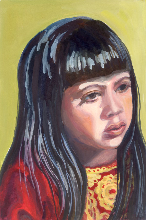
The other day I got a mysterious email from someone calling himself “Fake Dane.” He wrote, “Hey, I think your art is great. I was wondering if you’d be willing to sketch me from a picture. I’m assembling a collection that I’d post. Dane”

And he sent me his photo. If you want to draw him too, just click the photo below and select All Sizes when you get to Flickr and then you can print it out:

Fake Dane's Photo

I wrote back, “Sure, why not?” and did the sketch above. I was going for caricature so I hope he’s not offended. (UPDATE: He replied and said he really liked it and put it on his blog. There’s some funny drawings of him as a vampire there too.) If you want to do a drawing of him and send it to him too, there’s instructions in the “Please Read” sidebar on his blog.

It was a fun, quick painting project on a day in the studio that was mostly spent at the computer, trying to sort out photos and compositions for upcoming paintings, something I don’t particularly enjoy doing. And that made me think about the differences between…

Alla Prima/Plein Air vs carefully planned painting

When I’m planning a painting I consider focus, value, composition, color scheme, etc. I do thumbnails and value sketches. If it’s something requiring exact proportions, such as a portrait of someone’s child, pet or home, I’ll start with a drawing and then work from a photo, tracing it onto the watercolor paper. But even with more carefree subjects like flowers and still life or landscapes, that prep work saves a lot of frustration once painting is underway. I’ve learned that lesson the hard way.

On the other hand, my understanding is that people who regularly paint alla prima (in one setting) or plein air make the prep work quick and intuitive and let go of exactitude, painting their impression of the subject rather than a careful rendering. I’ve done some and it’s a lot harder than people like Kris Shanks, Nel Jansen, Ed Terpening, and others whose blogs I enjoy visiting, make it look.

What I’m trying to figure out is how to combine the two approaches, or how to avoid all the labored pre-planning. Judy Morris, the teacher of the workshop I took in February, said that her favorite part is planning and composing from photos, not the actual painting. For me it’s the opposite — while I enjoy drawing, I love painting more and don’t really enjoy spending a lot of time photoshopping compositions and sorting through photos at the computer. (She does the prep work manually, working with black and white photocopies and enlargements of the subject and background, which she cuts out and assembles.
On the other hand, if I don’t do the pre-planning (especially with watercolor) the whole painting ends up being a study that has to be done over. I guess with acrylics and to some extent oils, one can just keep working on and changing a piece until it’s right, but I’m not sure if that’s a great way to go either.

I’m hoping to find my own way of working that incorporates the best of both worlds.