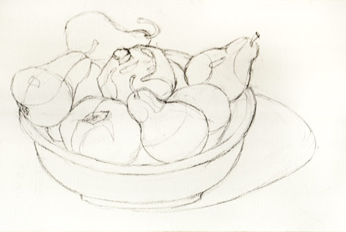
I’m so much happier with the way this watercolor of my bowl of fruit turned out than the one in my sketchbook. It makes such a difference to use Arches 140 lb cold-pressed watercolor paper. It also helped that I was painting consciously and taking my time, instead of rushing through it, half asleep as I had been when I made the sketch.
Even more fun is that I made the the large porcelain bowl when I was a potter and had glazed it with two of my favorite glazes…and now I was “glazing” it again, in watercolor.
I enjoyed every bit of the process, from planning the composition, to drawing (see below) from life, to masking the whites, then painting one shape at a time, using juicy washes, adding color wet-into-wet, as well as glazing over dried washes, then removing the mask, softening the highlights and some edges.

Since I’m teaching a watercolor class right now, I tried to also pay attention to my process so that I could better explain to my students how and why I did what I did. I surprised myself with the range of techniques I was actually using in one painting. Even though in class we study them as separate techniques (flat wash, graded wash, wet-into-wet, etc.) you often need them all in one painting and sometimes in one passage of a painting.
(Boring technical stuff follows…read at your own risk…) For example, after the fruit, bowl, and shadow were painted I did a flat wash of Ultramarine Blue mixed with Burnt Sienna for the neutral background. Then it felt like the table top, which I’d initially left white with just a light blue shadow, needed paint too. So the first layer was a pale flat wash of Cadmium Yellow. When it dried it didn’t feel warm enough so I glazed over it with a flat wash of Permanent Rose (so that the whole table top was the pale apricot color now only seen on the right of the table top). It still wasn’t warm enough so I did another wash of Permanent Rose mixed with a little Cadmium Yellow and let it fade out 3/4 of the way across. I liked the way that looked but now the shadow was too pale. So I glazed over over the shadow a couple of times and then softened the edges of the shadow where it meets the table top.)
3 replies on “Better Bowl of Fruit, Better Watercolor: Now I Can Eat the Fruit!”
This painting is obviously more polished and finished than the sketch. Bit they are both very good each in its own way. I like the ease and imperfection of the sketch, the carefree feeling of it.
LikeLike
This is a beautiful painting and I agree with the above comment, the sketch and the painting were both good! Doesn’t it feel like an achievement to consciously spend time on a painting and it works!!! So often I think my sketches are better because I don’t overwork them….quite the opposite!! I wish I lived closer to take one of your classes…
I’m a beginning….don’t quite think I can call myself a potter, but I’ve got a kiln bought specifically to make tiles. Now I’m obsessed with making a cup! I’ll have to post a sketch of my first effort…..pretty wonky!!
LikeLike
This is just lovely! And your “boring technical stuff” is a terrific learning opportunity for me. Thanks for including it.
LikeLike