Categories
Still Life Watercolor

Kiwis

Kiwis

Drawn first with Lamy Safari pen and Noodlers Ink then
Watercolor in 5.5″ square Hand Book Co. journal
To enlarge, click image, select “All Sizes”

I was too sleepy tonight to get back to my oil painting, so I decided to do a little watercolor of these kiwis who have been waiting patiently for me to paint them. I was pleasantly surprised how well the Hand+Book Co. journal stood up to lifting out paint with a wet brush. It’s just as nice a book as the Moleskine but the paper seems a little sturdier and the square format is fun. The notebooks have more pages than the Moleskines so they’re thicker and heavier to cart around. I guess it’s like diet food–you pay more to get less. Go figure.

I always think of these little Pyrex custard cups as “Grandma’s” because even though they came from Bed Bath and Beyond, they always remind me of the ones she handed me, filled with pudding or ice cream.

I’ve heard the best way to eat kiwis is the scoop them out with a spoon…so I’m off to give that a try.

Categories
Oil Painting People

First pass at oil painting

First pass at oil

First layer of oil sketch with 2 colors (burnt sienna & ultramarine blue), 12 x 16 inches

I’m feeling a little sheepish about posting this wonky off kilter portrait but it’s today’s sketch….so here it is. I had the canvas on an easel at too much of an angle I think — her face seems distorted in the photo and it wasn’t when I was painting it.

Having not used oils for 20 years, I didn’t quite know how to start so I grabbed a photo of someone dear to me, squeezed out some burnt sienna and ultramarine blue on my palette and started drawing with a brush and thinned paint. I was trying to avoid turpentine, using Galkyd and Gamsol (alkyd medium and odorless mineral spirits — OMS — by Gamblin which is supposed to be less toxic than others). First I tried paint diluted with 50/50 Galkyd and Gamsol but it still seemed too rich for a first layer so I started using just the Gamsol thinner and that didn’t work too well–it started dissolving the paint around it. (Oil paint has to be painted lean to fat — the first layers need to not have too much oil in them or subsequent layers won’t adhere properly.)

I loved the way it felt to work with oil — to be able to sort of sculpt with paint and have it slide around nicely. Now I need to wait for this to dry and then I can go in and fix the drawing and then start on skin tones. It’s interesting feeling like a beginner again…I’ve forgotten so much of the little I knew about oil painting but hopefully that little will return and the knowledge and skills I’ve developed with watercolor and drawing will be helpful.

Fortunately it was a warm evening tonight, even though it’s raining, so I could leave my windows and door to my studio open while using the OMS. The stuff didn’t smell, but now I have a weird metallic taste in my mouth which means there was something toxic in the air and which means I won’t be leaving a container of OMS open while I work again.

Categories
Block Printing Oil Painting Still Life

Good day in the studio

Linoleum block print 4″x5″ DS water-based ink on Arches cover paper
(To enlarge any of the images, click image, then select “All Sizes”)

Yes, I’m back to the lantern image again. This time I drew it on paper, traced it on a linoleum block and then carved all the areas that appear white in the image. Then I inked the block and rubbed the paper onto the block. I’ll add watercolor when the ink is dry.

Doing all the carving gave me a terrible stiff neck from looking down so long. I also tried adding some colored ink designed for monoprinting that was too wet and didn’t quite work out (below).

Linoblock print with DS black ink and Akua Color yellow, red and blue monoprint inks on Stonehenge print paper

Today I also started my experiment with oil paints, although I’m wondering if I should have gone to acrylics instead. I’ve long been admiring Andrea’s acrylic paintings and Carla Kurt’s beautiful acrylic painting here. Both of these artists have generously shared information with me about acrylics that have tempted me to jump right in and try them. But I’ve already got oil paints and love their consistency so I need to give them another go first. I dug out my old oil painting kit from 20 years ago and sorted out the paints and did some color tests. I’m worried about getting oil paint on my hardwood floors, clothes and cats, though I assume the problem is the same with acrylics. I guess I’ve been spoiled by the easy cleanup and low toxicity of watercolor which will probably always be my #1 medium.

I feel so sentimental about my old oil paint kit (just smelling the linseed oil brings back many happy memories of my life back then) so I took a picture of it. Here’s the kit and my paint tests:

oilpaints

(Painting kit, oil paints, flesh tone color mixing chart)

It was a good art day. I also took some photos for a possible still life painting. I put these veges together for my class on Saturday and stuck the setup in the fridge so I could photograph it. But after a couple shots my camera battery died and when it was charged again, the sun disappeared so I wasn’t able to get just what I wanted. I think the one with the white cloth is my favorite except there are no shadows since the sun was behind a cloud. I’ll probably just combine elements from the photos once the veges themselves get funky.

What do you think? (ignore the background–the grass and fence won’t be in the painting).

(Comments welcomed on acrylic vs. oils, photo selection or anything else — but you have to scroll back to the top to click on Comments.)

Categories
Outdoors/Landscape Plein Air Sketchbook Pages Watercolor

Painting Palms in the Dark

Painting Palms in the Dark

Ink and watercolor in large Moleskine watercolor notebook
(To enlarge, click image and select “All Sizes”)

The other night Michael and I were driving down Santa Fe Ave near Gilman in Berkeley and he pointed out these two palm trees that were lit up and glowing in the dark. Tonight I returned to paint them in the dark from the front seat of my car. I couldn’t exactly see what I was doing or what colors I was getting. The light in my car was fairly dim and my paper looked brownish instead of white. I was excited to get home and see it under the light, where it looks completely different. I’m really starting to enjoy letting things just happen with my art instead of trying to control it so much. That’s a wall  covered with ivy in front of some small trees in front of the palms, in case you can’t tell.

I’ve been noticing palm trees lately and wondering….why do they exist? Why did they evolve to be so tall and skinny, with the leaves/fronds and fruit up so high up?

Categories
Still Life Watercolor

Persimmon in Spoon Holder

Persimmon

Ink & Watercolor in Large Moleskine Watercolor Notebook
(To enlarge, click image, select “All Sizes”)

It felt like time to get back to some color tonight and this persimmon was a willing victim for a quick little study.

I stopped at the art store on the way home from work tonight and ended up spending too long (and too much money), gathering oil painting supplies and learning from a knowledgeable employee about improvements in oil painting materials since I last used them 20 years ago, and how to work with the new safer mediums and solvents–no more turpentine. I remember being in an oil painting class at SF City College in a room without special ventilation, with 30 students all having open containers of turpentine and paint thinner. By the end of class I’d feel like I was drunk–just one of the many reasons I seem to have so few functioning brain cells these days, I’m sure!

It felt weird buying white paint, since in watercolor one tries to save the white of the paper for areas that are to remain white. With oils you can add a highlight or a light area at the end of the painting, which rarely is successful with watercolor, unless you don’t mind opaque paint on top of a transparent watercolor.

My plan is to try to use the oils like watercolors, glazing in layers. I’m certainly not planning to give up watercolor, but every now and then there’s something I’m painting that seems to want to be more opaque and have greater depth.

Categories
Other Art Blogs I Read Plants Sketchbook Pages Watercolor

Just a Value Sketch (Persimmon)

Persimon-value sketch

Above: Watercolor in Raffine sketchbook

Below: Original photo and grayscale version
Persimmon photo persimmon-grayscale

(Click images to enlarge, select “All Sizes”)

I was inspired to focus on value studies by Katherine Tyrrell’s post about “the best ever workshop” she attended and her instructor’s “constant and particular emphasis on the huge importance of values when painting light.” For tomorrow’s watercolor class I’m going to ask my students to do some value studies and wanted to have one prepared in advance so that’s what my post is about today.

Value studies can be so helpful not just for figuring out the values that actually exist in the reference material, but also for deciding how to change the image before painting it. It gives you a chance to consider where values need to be different to help the composition and for that matter, how does the composition need to change to be more successful?

It seemed to me that my original photo, while bright and colorful didn’t have much of a range of values so I tried to increase the contrast by adding stronger darks when I did the value study. Then I converted the original photo to grayscale to compare to my 0ainted version. I think somewhere in between the two might be best. I scanned the pencil drawing before painting it, so it will be easy to print it again and paint it again, if I decide to.
I’ve found that students usually grumble about having to do value studies–it seems too much like eating enough fiber or flossing teeth. I guess value studies just don’t seem that sexy (I hate it when people use the word sexy to describe things having nothing to do with sex like cellphones, cars, and now painting…but somehow that word works here…though now I’ve probably now increased my spam by using it…) in the way bright wet-in-wet washes or painting glass or thunderclouds are. But there’s nothing that captures light in a painting more than really nailing the values and getting those darks and lights in there.

I took this picture today when I was taking a nice walk in the Berkeley hills with my sister just after it had rained. It was supposed to rain all day today and I was all set for a cozy day at home in the rain but instead it was hot and sunny….in November?

Categories
Animals Every Day Matters Watercolor

Seagull (Everyday Matters #90 – Things with wings)

Seagull with background

Watercolor on Arches watercolor paper, 7.5 x 11 inches
(To enlarge, please click image, select “All Sizes”)

This seagull sat on the post by the boat while we dined on Saturday evening. I thought it was curious that this guy would just sit there, only a few feet away, watching us. Then someone threw a bean from their salad off the boat and Mr. Seagull was on it in a second. I threw him a couple more beans for fun until Cody pointed out that now the poor bird would get gas so we stopped throwing him beans.

The picture above is the final painting. The one below is pre-painting in the background. I always seem to prefer a white background, but the sky was so blue in the photo I just had to paint it. Which do you prefer?

Seagull before background

Same painting before sky painted in.
(To enlarge, please click image, select “All Sizes”)

Categories
Other Art Blogs I Read Watercolor

Glow (in progress) and Art Thoughts

Glow (painting in progress)

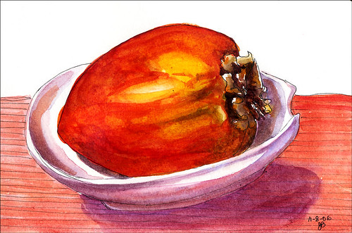
Watercolor on 7×11″ Arches paper

In did this in preparation for a painting demonstration in my watercolor class tomorrow. Even though it’s not finished, I thought it was pretty just as is and decided to post it.

Thoughts and questions about art kept me awake all night last night after yesterday’s evening trip to the California Watercolor Association annual national show and the SF Museum of Modern Art so I thought I’d share some of them here.

First a quote I heard on NPR this morning:

“I think balance is overrated. Creativity comes from excess.”
Annette Benning, said this when asked about finding balance between being a mom of four and an actor. I think this is a fascinating statement, though I’m annoyed since it would never be asked of an actor/father.

As I mentioned in yesterday’s post, the CWA show was a disappointment to my painting group and me. We had submitted slides to the show but didn’t get in, assuming it was partly because the juror’s style and preferences weren’t a good match for our work AND that he had to pick 90 pieces out of 600 slides. A few were stunners, but we thought many seemed mediocre, unfinished, or amateurish. After several weeks on display in a great location, only two of the 89 pieces had sold, and both, though watermedia, looked more like oil paintings. (I hope this doesn’t sound like sour grapes — we really wanted the inspiration of seeing some great work.)

Then we went to SFMOMA and Sharon raised an interesting question while we were looking at some of the early works of Matisse and other early modern artists — “Would we have thought these were bad paintings too, if they were hanging in the CWA show?” I know the art world certainly thought so at the time Matisse and his colleagues were painting, but they were struggling and sacrificing greatly to break through to a whole new world of artistic expression.

In looking at the Picasso, Frida Kahlo, Willem de Kooning, Georgia O’Keefe, Jackson Pollock, and Mark Rothko paintings (in two adjoining rooms), I thought about how each of them created a new and unique way of expressing their vision. Is that what “real art” is — work that creates a new view or means of expressing one? Does it have to be new to be good? What about work that is beautiful, but doesn’t express a unique view or style? Is that art? Can there possibly be anything new after everything that’s already been created?

When we were walking back to BART in the dark, I noticed a brightly lit window on the second floor of the University Extension building where a roomful of art students were diligently painting at their easels. For a moment I felt overwhelmed — so much good art already exists…so many people striving to make art…and for a moment I thought, “Why bother….it’s all been done before, by people way more talented than me…”

And then I immediately knew the answer! Because it’s the joy in making art that matters, whether it’s good art, bad art, real art, or not art at all. It’s the process, not the product…the seeing, the investigating, the learning, the pleasure of color and line and design.

I’m guessing that was true for those artists whose work hangs in museums, many of whom were never appreciated while they were alive. They painted, drew, sculpted because they had to. They painted because balance didn’t matter to them, just their inner drive to create and express what they had to say.

And there is still the possibility of new voices and styles…I see them every day just on the artblogs I visit. Each person has their own recognizable style, their own way of seeing the world and it shines through their work.

Categories
Outdoors/Landscape Plein Air Watercolor

Blake Garden Pagoda & Art Show

Blake Garden Pagoda

Watercolor and Ink on 9×12 Arches watercolor paper
(To enlarge, click image, select “All Sizes”)

I did this plein air painting on Monday afternoon at Blake Gardens. I got there 90 minutes before closing with a plan to paint the redwoods and creek area (just behind this little pagoda fountain). Unfortunately, landscape architecture students from U.C. Berkeley (the gardens belong to the University) had been allowed to do “art installations” and the creek had been covered with large white posterboards with yellow tape stuck here and there. (Is this art?) I had to quickly pick a spot to paint so settled for this fountain that was brightly lit on the edges by the setting sun at first. I painted without much drawing and then added the ink, using a non-permanent Pentel ink brush pen. I softened and bled the ink with a little water here and there.

Tonight my painting group met at the California Watercolor Association’s National Show held in downtown San Francisco’s Academy of Art gallery. There were a few stunning pieces, but the majority were disappointing. Someone was smoking cigarettes near the door and the gallery smelled horribly of cigarettes and was hot and stuffy so we headed over to the San Francisco Museum of Modern Art three blocks away for a delicious dinner in the cafe and a visit to some “real” art (What makes something “real art?”).

I enjoyed seeing some Matisse paintings and sculpture on display that he made in the period I’m now reading about in the two volume, 1200 page biography, The Unknown Matisse and Matisse the Master. Then we saw an absolutely thrilling show of enormous sculptural paintings by German artist Anselm Kiefer. The scale, perspective, brilliance and 3-dimensionality of the work was breathtaking.

While we dined and looked at art we had many thought-provoking conversations about art, artists, showing, painting, and teaching. I’d love to share them with you but I’m falling asleep standing up (my computer is on a standing-height work table) so it will have to wait.

Categories
Flower Art Sketchbook Pages Watercolor

My bottle is back!

Hennessy Cognac bottle

Watercolor in Moleskine 5×8″ watercolor notebook
To enlarge, please click image, select “All Sizes”

A package was waiting for me when I came home from work tonight. It was this little bottle that I’d loaned to a watercolor student months ago. She started painting it in class and wanted to finish at home so I sent the bottle home with her. Then she injured her arm and wasn’t able to return and since she lived quite a distance from me I told her to just mail it to me. I knew she would when she could and I was so happy to see it today.

It’s funny how finding a lost something like this little Cognac bottle can mean so much. I’ve painted it many times and just really love this little bottle that I originally found on the street. I’ve wondered why it was there–would the average bum or teenager be drinking cognac on the street? I don’t know anything about liquor, but always though cognac was fancy stuff, not on the same level as Colt 45 (had to look this up–I originally said Colt 44 but that’s a gun, it turns out) or Thunderbird (had to look that up too–there’s actually a website about bum wines.)

I’m just so pleased to have my little bottle home. I know some people like diamonds, fancy cars and yachts but I can be just as happy with a quiet hour painting a flower in a sweet little bottle.

To comment, click “Comments” at top of post.