Categories
Faces Oil Painting Other Art Blogs I Read Painting People Portrait

Francis: Work in progress, oils

Francis-Grisaille underpainting done

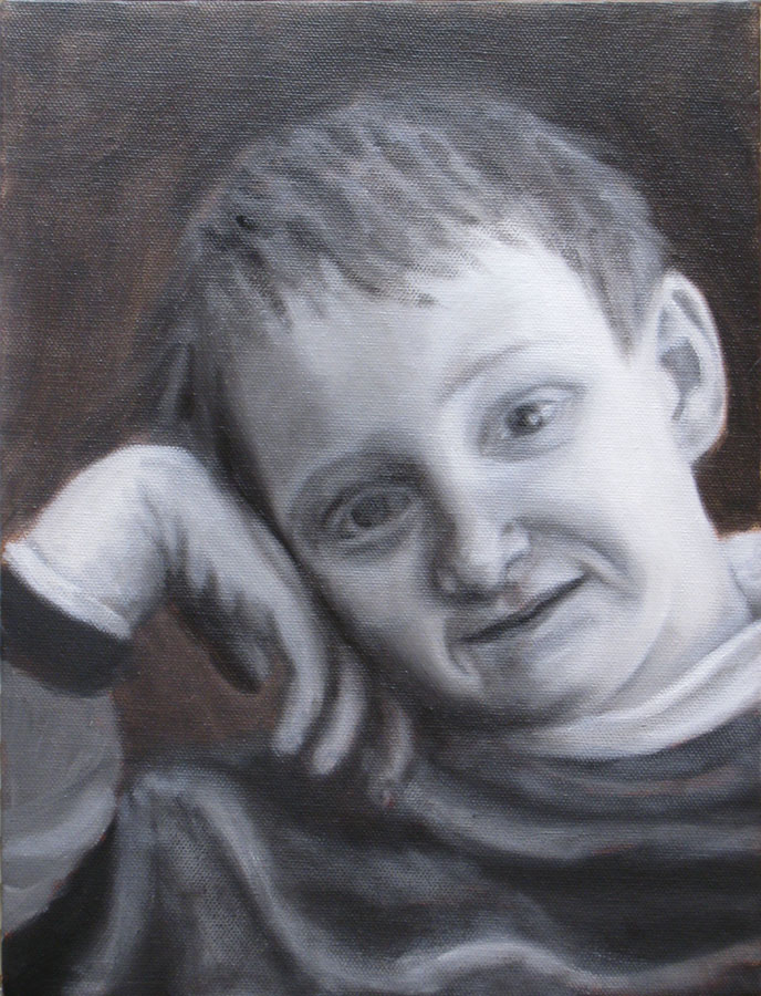
Grisaille underpainting, oil on canvas, 9×12 (larger)

Francis is a little boy I photographed (with his mom’s permission) in the cafe at the Museum of Modern Art in San Francisco. Something about his red hair and sweet, wise nature made me want to paint him. This is a second attempt–the first got tossed. I’m trying a technique I recently saw demonstrated at the California Watercolor Association meeting. The goal is to end up with strong darks, high contrast and glowing skin. The artist who demonstrated the technique started her demo by showing slides of Caravaggio‘s paintings. He is known for strong contrast of glowing light in an otherwise dark scene, known as Chiaroscuro.

Once this layer dries I will be painting over the underpainting with a thin layer of color, trying to allow the darks and lights to remain and show through.

Francis-sketch on toned canvas
(above) First I started by toning the canvas with a thin wash of acrylic burnt umber paint. Burnt sienna would have been better though–this color is too dark and not warm enough. Then I used Saral transfer paper to trace the enlarged photo onto the canvas. Portraits are the one subject that I still do that kind of transfer instead of drawing freehand when I want to be sure to get a resemblance with all the features the right size in the right place.

Francis-Getting started

(Above) Next I started blocking in the dark shapes and lines I saw using burnt sienna oil paint thinned with Gamsol Odorless Mineral Spirits.

Francis-blocking in

(Above) Once I had the shapes blocked in I was ready to start adding the black paint, trying to keep it thin so some of the burnt sienna would show through.

Francis-Grisaille underpainting started

(Above) Then I started adding white paint, trying to make smooth transitions between dark and light. And this brought me to the finished grisaille underpainting at the top. Now I just need to let it dry and then start adding the thin layer of color and see what happens.

Categories
Art theory Oil Painting Painting People Photos Portrait Puerto Vallarta

Work in Progress: Puerto Vallarta Cowboy in oil

PV Cowboy - Oil painting layer 2

Oil painting IN PROGRESS – 22 x 28 inches
Click here to see larger

I started this oil painting today from a photo I took in Puerto Vallarta a few months ago (see bottom of this post for the original photo). I thought I’d track my process and progress and post the results as I go.

(Clicking on any of the pictures below will take you to Flickr where you can click All Sizes to see larger)

Original thumbnail sketches

Above are the thumbnail sketches (each about 2″ x 3″) that I did first, trying to work out the composition and colors. I needed to make the sketch match the dimensions of the canvas. Unlike watercolor paper that you can cut to any size, with canvas you either have to stretch it yourself (been there, done that) or use standard sizes.

Above top right: I used grey markers to work out the values but I didn’t change the composition from the photo. Above bottom left: In this grey marker sketch I moved the cowboy to the right, adding more wall between him and the door and added some white gel pen to put back light I lost. Above bottom right: I used gouache to work out the colors.

Enlarged photo with cowboy moved Drawing on colored acrylic ground

(Above left) I placed the original photo in InDesign so I could print it out in grey scale in”tiled” pieces and then I taped the printed sections together so that it would be the same size as my 22×228 canvas. Then I printed just the cowboy in color and stuck him where I wanted him on the large printout. I could have done this in Photoshop but decided it was quicker to do manually. It’s placed over the canvas in this photo.

(Above right) I toned the canvas with acrylic paint mixed to a sort of orangey-brown. I used a sponge brush and kind of messed it up, going over an area that was partially dry, which took off paint instead of putting it on. Fortunately it was in an area where there’s a textured wall so it didn’t matter. Then I put a sheet of Saral graphite “carbon paper” between my enlarged printout and the canvas and using a stylus originally designed for using on a Palm Pilot PDA, drew (invisibly) along the outline of the shapes on the enlarged photo. The Saral paper transfered those lines to the canvas. Unfortunately I didn’t notice the enlargement slipped so I had to retrace the guy again, half an inch to the left which left a lot of confusing double lines. The main reason I wanted to trace was to get the shapes on his face right and they were totally messed up. So I redrew him over the graphite lines with a fine point Sharpie instead of tracing, which worked OK.

Working from enlarged thumbnail sketch & photo

Above: I scanned my thumbnail value sketch, enlarged it to 8×10 and printed it out and stuck it on my easel along with the reference photo and then….

5-Monochrome acrylic underpainting

Above: Using black acrylic gesso I referred to my value sketch to make a grisaille or monochrome underpainting over the orange. Now that I’m looking at this I realized I forgot to put the grey rectangle behind his head that will have the text on it and the orange is looking paler than it really was.

6-Painting the face upside down

Above: I was having trouble with the face so I enlarged his face and printed it, then turned the canvas and the printout upside down and tried to get the shadows and value patterns right on his face.

Then I blocked in the first layer of color with oil paints over the underpainting (picture at top of post). Once it dries I’ll paint another layer. I plan to work loosely, avoiding overworking, especially the door on the left which I like just the way it is.

Below, the original photo. Isn’t he wonderfully macho?

Original photo

Categories
Life in general Oil Painting Still Life

Rainier Cherries (Oil painting)

Cherries Oil Painting - Finished

Oil painting on RayMar panel, 8×6″
Click here to see larger

I’ve been dieting the past couple weeks, trying to take off the 10 pounds I put on over the past year and a half of blogging instead of jogging. It’s been made considerably easier by the wonderful fresh summer fruit I’ve been eating. I think the cherry season might be waning now, which makes me sad since these Rainier Cherries are more delicious than any of the junk food they replaced. I’ve lost the first five pounds and hope to be done with the diet before the succulent peaches, plums and nectarines are gone.

Oil painting is so much fun. I’m really enjoying working alla prima (with fresh paint, finishing a painting while all the paint is still wet, rather than letting it dry and painting in layers). I’m practicing this technique so that I can eventually try painting plein air with oils (but it will be a while before I’m ready for that.

Here are the steps in making this painting (if you want to see them bigger you can click on the images and and then click All Sizes:

The sketch with vine charcoal:
Cherries Oil Painting-Step 1

Blocking in the shapes and colors:
Cherries Oil Painting-Step 2

Almost done…should I have stopped here?

Cherries Oil Painting-Step 3

I had a hard time with the background, which is a white plate. It had some reflection from the cherries, highlights from the lamp pointing at it and a bit of shadow around the rim. I’m not sure if I should have stopped sooner or worked on this painting longer but since it’s about learning and practicing and moving on to try something else, I think I’m done. Any suggestions or advice very much welcomed!

Categories
Oil Painting Painting Still Life

What color is a lemon?

Lemon on green glass plate (P1010468)

Oil on panel, 6×8″
Click here to see larger

Despite today being my last day of vacation, my cat barfing in response to fireworks, and my 3-year-old refrigerator dying yesterday, my muse has finally returned and I got started on some new painting projects. The first one is this small oil painting to try to understand what color the inside of a lemon is. It’s easy to say yellow, but as my friend Susie said, it’s transparent and reflective, like glass–and therefore not really any one particular color. I set it up on green glass so on the thin slice, the green shows through. The inside of the lemon is paler and less yellow in the original painting but I couldn’t get it quite right on the screen. Anyway, it’s not a masterpiece, but I’m pleased with getting the hang of the alla prima process (doing a whole painting at one time) with oils, and just love the feel of working with them.

Dry Ice: Interesting Stuff
Tuesday after lunch I realized my refrigerator wasn’t working and learned that the repairman couldn’t come until Thursday so I went off to buy dry ice. The guys in the shop were sympathetic and gave me 80 pounds of the stuff for free. I carefully carried in the steaming, icy bags, using potholders, 1 block at a time, loading it into the freezer and fridge. Later when I talked to my mom, she reminded me that I had another refrigerator in my studio kitchen (my house is a duplex, and the back unit is my studio). Duh!!! I rarely turn that fridge on since it’s a power hog, just using it to store extra beverages.

I turned it on and waited for it to get cold enough. Then I loaded all groceries I’d bought the day before into my laundry basket and carted them to the other kitchen. I was stunned to see that in that short time, all my wonderful lettuces and herbs and vegetables had frozen solid and were ruined. Then I left a few bottles of beer and some cans of soda in the broken fridge with the dry ice, thinking they’d be fine. I bet you can guess what happened next: The soda cans froze, expanded and exploded, covering the inside of the fridge with a layer of ice and icicles. In the freezer, frozen berries had turned to soup and they made their own lovely purple puddles of ice. But I just ignored the whole mess and spent the day in the studio.

Categories
Landscape Oil Painting Other Art Blogs I Read Outdoors/Landscape Painting Photos

Pt. Reyes in Oil

Pt. Reyes-Oil-IMG_0993

Oil on canvas, 16 x 20″
Click here to see enlarged view

Yippee! I finally got back to oil painting and I think that everything I’ve learned in acrylic and gouache and from reading books on landscape and seeing other people’s instructional photos and videos on the web and especially the great advice I’ve gotten from other art bloggers finally clicked. I was actually able to capture just what I wanted to in this painting, which is a rare gift!

I just wish I could tell whether the images look right on the screen. I still haven’t quite gotten my monitor calibration dialed in. In the painting the distant hills and mountains look a little misty–like there’s lots of atmosphere/fog between them and the viewer, subduing the colors. The blue peeking through the clouds is ultramarine not cyan like it appears on my monitor. But this afternoon I wanted to paint, not futz around with computers. I did enough of that last weekend!

Here are the things I’ve learned about oil painting that I applied:

  • I limited my palette
  • toned the canvas with a wash of acrylic yellow ochre
  • painted the sky white and then blended in the blues
  • blocked in the darkest darks, the mid-value big shapes, and then did the next smaller shapes and then added details.
  • I made sure to wipe my brush if it picked up some of the wrong neighboring color before applying more paint
  • I didn’t let myself get lazy about mixing colors from whatever was left on the palette instead of adding the missing color in fresh paint
  • And I stopped before I overworked it and didn’t get hung up in details

And here are the people who I pestered for oil painting advice (which they generously gave me) that finally sunk in:

I did the painting from this photo I took on a hike in Pt. Reyes to the ocean. I painted it this afternoon in about four hours (including cleaning up), trying to pretend that I was painting plein air:

Pt. Reyes original photo

Categories
Oil Painting People Photos Sketchbook Pages

Woman at the museum

Museum woman

Oil on canvas board, 12 x 16″
To enlarge, click images, select All Sizes

Museum-woman2

Thumbnail sketch (1.75×2.5″) in sketchbook for painting

SFMOMA

Ink in small Moleskine notebook
(original sketch at SF Museum of Modern Art cafe)

A few weeks ago I went to see the Picasso and American Art exhibit at SFMOMA and was inspired by this woman’s thick, grey hair in a giant clip and the way the teeth of the clip separated her her hair. I also took a photo of her while I was there (below) but the view was different from my drawing so I didn’t end up referring to it when I made the painting. I’m still struggling with oils and acrylics but this one was a little easier because I stuck to black, white and 3 grays. I had intended this to be an underpainting and was going to glaze over it with the colors of eggplant and chocolate but decided to leave it because I like it the way it is.

I used Gamblin Chromatic Black for the darkest darks which is not a dead black pigment like most. From the Gamblin website: “Chromatic Black is black, but it has no black pigment in it. It is made from two perfect complements: Quinacridone Red and Phthalo Emerald.” For the grays I used Gamblin’s Portland Greys in light, medium and deep. So there was no color mixing, just a value study and an attempt to get some control with applying and blending oil paints.

IMG_0663

Categories
Flower Art Oil Painting

Funky roses under wrong light

Funky roses in oils

Oil on canvas board, 12×16
Click image to enlarge, select All Sizes

My next door neighbor was about to toss this bouquet of roses on Friday because they were at that funky, fully-bloomed, starting to get a little stinky stage, but I swooped in before they could go in the recycling bin and rescued them to paint. I was trying hard to loosen up and have a more painterly, impressionist way of painting them. But I discovered the importance of good lighting when mixing colors and painting with oils.

The painting looked really pretty while I was painting under the lights I’d rigged up to my easel. But the next day when I looked at it in daylight it looked like dull mud instead of brilliant. The lights I was using were too much on the pinkish side which made all the colors I mixed look much pinker and brighter than they really were so once the lights were off…mud.
ContactSheet-001

Above, top left: my new Verilux florescent lighting. Top center: outdoors at noon. Below, top right: the lighting I was painting under originally.

ContactSheet-002

I started researching lighting for easel painting, and after buying numerous different “full spectrum” and halogen lamps, I finally found a solution that worked: an overhead florescent light fixture designed for kitchens with 4 Verilux full spectrum florescent bulbs. The fixture has electronic ballast that prevents typical florescent noise and flicker. The light is amazing–very much like bright noon sunlight. Maybe even a little too bright, but I’m not sure because I’m slightly migrainey today, making my eyes overly sensitive. If it’s too bright I can swap out any of the bulbs for a warmer or cooler version, according to the lighting store where I bought it.

To test all the various lights I tried, I set my camera at “sunlight” and then took pictures under all the different lighting arrangements of the same image and they all came out terrible. With my new light and the camera set at sunlight, I took this picture and it is pretty accurate! Yay. A good painting light and a good photography light!

Here’s all the stuff that didn’t work:

  • an Ott floor lamp that gave virtually no light at all
  • a Verilux floor lamp that gave twice as much light (but twice nothing isn’t much) but the light was very blue and only from one side — nowhere near enough to paint by
  • an easel lamp designed for my easel that is attached at the top to the center post — tried it with a verilux full spectrum bulb, a screw in halogen, a GE Reveal bulb (these are evil–they make everything look beautiful but are way too pink and that’s what messed everything up)
  • a “Combo Lamp” clamped to the side of the easel — it has a circular florescent and a regular light bulb in the middle (these are what I use on my drawing table, one on each side and they work great for watercolor and drawing).
  • Halogen torchieres in the room already
  • A photo light stand with a variety of different bulbs in it
  • All of the above

Then after all that shopping, I had to do an equal amount of unshopping! Yuck. What a way to spend my days off. But thanks to my darling son who helped me hang the new light fixture in the studio, at least I have my new light all set up–just in time to go back to work.

Categories
Oil Painting Still Life

Enough already!

Veges-oil

Oil on canvas board, 16×12″
To enlarge, click image, select All Sizes

I’ve been working on these two oil paintings for way too long and I officially call them done. Now it’s time to move on. I learned a lot, including that it’s really hard to photograph them, especially at night. The one above is based on a couple of photos I posted here when I first started working on this piece. It’s been through soooo many changes and I’m so done with it!

Roses-oil
Oil on canvas, 12 x16″
To enlarge, click image, select All Sizes

For the painting above I’ve since done value and compositional sketches to improve on the reference photo (all posted here) but I’d already started this painting and so kept on plugging away until it was finished. Now I can start over with the better composition. Towards the end I was just making up leaves and making more negative space to try to help the composition. The colors and values are better in real life. The painting looks kind of dull and yellowish in this photo.

Now I have 16 brushes to scrub and clean before I can go to bed and it’s already midnight. That’s what happens when you paint up until the last minute before going out for the evening. I really wanted to finish both paintings before going out but I suddenly discovered I only had 10 minutes to get dressed, put on makeup, and feed the cats before Michael was supposed to arrive so I locked the kitties out of the studio and just left everything. We went out for pizza and then to see The Queen (I’m a Helen Mirren fan). Then I came back and finished the paintings. I’m tired.

Categories
Oil Painting

Painting in Progress

Painting In Progress - Vege Still Life

Oil painting in progress on 16×12″ board
Click images to enlarge, select “All Sizes”

1st Layer, 1st Oil Painting

Previous first layer of same painting

I’ve been trying to figure out how to resolve this dilema: Since I started posting daily sketches and small paintings to my blog about 8 months ago I haven’t been working on any larger paintings, preferring the immediacy of plein air painting and direct sketching and painting daily. Now I’m working on paintings that take more than one session to complete, in both watercolor and oils. On days like this when I’ve spent my art time working on a painting in progress, what do I post at the end of the day? Do I post the work in progress, an older sketchbook piece, or nothing at all? Today I decided to post what I worked on today plus the two reference photos (below) I’m combining to make the painting.

RawSaveP1010201 __ Vege still life setup 2

This painting has been my practice piece to relearn how to paint with oils. Today was a huge breakthrough. First I read an article about oil painting without using solvents that gave me some good clues and then I finally received the book I ordered, Janet Fish: Paintings. In looking her paintings and at my books of two other oil painters whose work I love,  Alice Neel and Jane Freilicher, I got inspired and  started painting. Instead of the frustration and left-brained how-to thinking that I’d been experiencing with oils I was able to just paint and enjoy the seeing deeply. That’s how it is when I’m painting with watercolors: I don’t have to think too hard, just work intuitively. Pretty exciting!!!

Categories
Oil Painting

More color studies

Color-Study-Secondaries

Secondary colors and their darkened, neutralized (grayed) cast shadows in oil

Color-Study-Primaries

Primary colors and their darkened, neutralized (grayed) cast shadows in oil

I’d hoped to have more to post tonight than these 8×10 color studies, but nothing else is finished. Also, the colors don’t look quite right on screen–the paintings’ backgrounds are brighter and not so mustardy or greyed looking. [If you want to know more about the process for mixing the colors for the cast shadows click on Comments where I describe it in response to Toni’s question.]

The 5-day weekend that had stretched out so luxuriously ahead of me a few days ago is gone now, and I barely accomplished half of what I’d hoped to do in the studio. But I’ve also done some really important things that I’d been slacking on the past few months, like sleeping, eating properly and exercising AND I spent hours in the studio every day, making progress and enjoying the process.

Now it’s time to clean oil paint off of a dozen brushes and then head off to bed so I get another good night’s sleep then back to the office tomorrow.