Categories
Sketchbook Pages Still Life Watercolor

Blue Thrift Shop Bottle

Little blue thrift shop bottle

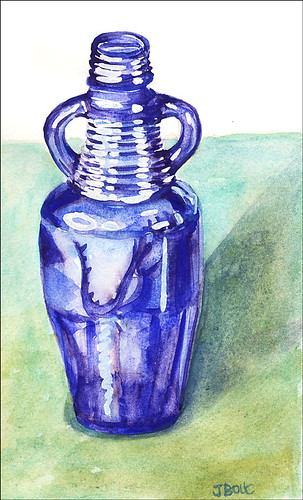
Kremer Pigments watercolors in large Moleskine watercolor notebook
(To enlarge, click images, select All Sizes)

Bottle value sketch

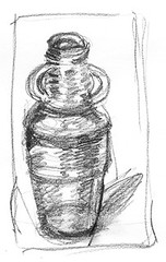
Quick value sketch before painting

I wanted to play with monotypes tonight but was too tired after working all day so decided to do a small watercolor sketch instead. I don’t know what this bottle held originally–nothing fancy, I’m sure. But I just love it’s proud stance, and hands-on-hips attitude. I found it at Thrift Town, a sort of thrift shop department store where I’d gone looking for a used doctor’s lab coat to wear while painting in oils to protect my clothes. They didn’t have any lab coats even though they said they did on the phone. Instead I found a soft denim old lady’s house coat in the bathrobe department which works perfectly and looks more like a traditional painter’s smock.

I used Kremer pigment watercolors for this painting even though I knew they weren’t quite the right choice. My regular Winsor Newton cobalt and ultramarine blues would have been more appropriately transparent and glowing, but I went with the more opaque and sedimentary (or is it flocculating?) Kremer pigments, just to see what would happen. They’re fun to work with and after several layers of glazes, gave the background an interesting texture. The Moleskine paper was pooping out though, starting to pill and dissolve so it was time to stop messing around and go to bed.

Categories
Every Day Matters Sketchbook Pages Still Life Watercolor

Spoons: EDM #94

Spoon - EDM 94

Watercolor, Noodlers Ink, and a dab of ProWhite in 9×12″ Aquabee Sketchbook
(To enlarge, click image, select “All Sizes“)

This week’s Everyday Matters challenge is “Spoon.” The large pink-handled cooking spoon and the tablespoon with the dull black plastic handle are the last remaining implements from my mother’s early 1960s kitchen complete with built in pink electric oven and stove. When half the pink handle broke off the big spoon I was sad, but it actually created a handy edge for propping it in pots. I use the black-handled tablespoon for everything I eat with a spoon. I love the way the handle feels in my hand and the way it holds just the right amount of cereal and milk. The slotted spoon is a good sturdy tool that’s always handy for serving veges.

The big wirey spoon is great for draining and lifting out a whole potful of raviolis like I did tonight. I used to use a special plastic pasta tool, part spoon and part fork, for that purpose but it now serves a different purpose. I slip it horizontally between the two handles of kitchen cabinet doors to keep the cats out of the trash. I’d first tried to install baby safety locks on that cabinet, but the instructions were impossible and I’m hopeless when it comes to measuring. I always end up skipping the ruler and trying to eyeball things, which never works. I got the little plastic hooky thingy in the wrong place, and then stripped the screw when trying to remove it, so now it is a permanent feature of my cabinet door, hanging there limply to remind me of my failure.

Anyway, these are all good sturdy tools that may be homely but they do their jobs well!

Categories
Oil Painting Still Life

1st layer of 2nd oil painting

1st Layer, 1st Oil Painting
Work in progress: Oil on board, 15 x 12 ”
(To enlarge, click image, select “All Sizes”)

This is the first layer: I expect there will be two or three more. Before I started this, I set up my palette, grabbed a library book with some oil painting technique exercises and tried doing the first exercise, copying a value study of layers of mountains. It was boring and awful. I finished it and tossed it, feeling discouraged. Then I decided to stop worrying so much and just start painting. I grabbed the photos I took the other day and used the veges and bowl from this one:
Vege still life setup 2

and next I think I’ll add the tablecloth from this one:
RawSaveP1010201

I ran out of time before I could start the background.

The biggest hurdle for me to get over is using white paint. For 20 years of painting with watercolor, I’ve learned to preserve the white in my paper instead of using white paint and to use more water to make colors lighter. There’s a big taboo about using white paint with watercolor–it’s considered “cheating” in some circles. I didn’t think I cared about that, that my preference for leaving the white of the paper had more to do with wanting the luminance and clarity that you don’t get with opaque white paint on top of transparent watercolor.

But when it came time to actually mix up colors using white paint, it felt like what I imagine an alcoholic might feel after being sober 20 years and then being told now it’s ok to drink and reaching for that first bottle. (Except I know there’s really no comparison–terrible things don’t happen from using white paint). But I was definitely stressing over it, which was interesting for me to observe. I received a couple answers to my worries about using white paint that I posted online. One person on Wet Canvas told me to paint a white object to get over it and Nel wrote and told me to “Use white paint happily and freely in oils!” She should know–her recent oils are scrumptious.

It’s going to be interesting switching back and forth between oil and water and monoprinting. I think I’ll try the same composition in watercolor tomorrow too–especially if this oil is still to wet to work with.

Categories
Still Life Watercolor

Kiwis

Kiwis

Drawn first with Lamy Safari pen and Noodlers Ink then
Watercolor in 5.5″ square Hand Book Co. journal
To enlarge, click image, select “All Sizes”

I was too sleepy tonight to get back to my oil painting, so I decided to do a little watercolor of these kiwis who have been waiting patiently for me to paint them. I was pleasantly surprised how well the Hand+Book Co. journal stood up to lifting out paint with a wet brush. It’s just as nice a book as the Moleskine but the paper seems a little sturdier and the square format is fun. The notebooks have more pages than the Moleskines so they’re thicker and heavier to cart around. I guess it’s like diet food–you pay more to get less. Go figure.

I always think of these little Pyrex custard cups as “Grandma’s” because even though they came from Bed Bath and Beyond, they always remind me of the ones she handed me, filled with pudding or ice cream.

I’ve heard the best way to eat kiwis is the scoop them out with a spoon…so I’m off to give that a try.

Categories
Block Printing Oil Painting Still Life

Good day in the studio

Linoleum block print 4″x5″ DS water-based ink on Arches cover paper
(To enlarge any of the images, click image, then select “All Sizes”)

Yes, I’m back to the lantern image again. This time I drew it on paper, traced it on a linoleum block and then carved all the areas that appear white in the image. Then I inked the block and rubbed the paper onto the block. I’ll add watercolor when the ink is dry.

Doing all the carving gave me a terrible stiff neck from looking down so long. I also tried adding some colored ink designed for monoprinting that was too wet and didn’t quite work out (below).

Linoblock print with DS black ink and Akua Color yellow, red and blue monoprint inks on Stonehenge print paper

Today I also started my experiment with oil paints, although I’m wondering if I should have gone to acrylics instead. I’ve long been admiring Andrea’s acrylic paintings and Carla Kurt’s beautiful acrylic painting here. Both of these artists have generously shared information with me about acrylics that have tempted me to jump right in and try them. But I’ve already got oil paints and love their consistency so I need to give them another go first. I dug out my old oil painting kit from 20 years ago and sorted out the paints and did some color tests. I’m worried about getting oil paint on my hardwood floors, clothes and cats, though I assume the problem is the same with acrylics. I guess I’ve been spoiled by the easy cleanup and low toxicity of watercolor which will probably always be my #1 medium.

I feel so sentimental about my old oil paint kit (just smelling the linseed oil brings back many happy memories of my life back then) so I took a picture of it. Here’s the kit and my paint tests:

oilpaints

(Painting kit, oil paints, flesh tone color mixing chart)

It was a good art day. I also took some photos for a possible still life painting. I put these veges together for my class on Saturday and stuck the setup in the fridge so I could photograph it. But after a couple shots my camera battery died and when it was charged again, the sun disappeared so I wasn’t able to get just what I wanted. I think the one with the white cloth is my favorite except there are no shadows since the sun was behind a cloud. I’ll probably just combine elements from the photos once the veges themselves get funky.

What do you think? (ignore the background–the grass and fence won’t be in the painting).

(Comments welcomed on acrylic vs. oils, photo selection or anything else — but you have to scroll back to the top to click on Comments.)

Categories
Still Life Watercolor

Persimmon in Spoon Holder

Persimmon

Ink & Watercolor in Large Moleskine Watercolor Notebook
(To enlarge, click image, select “All Sizes”)

It felt like time to get back to some color tonight and this persimmon was a willing victim for a quick little study.

I stopped at the art store on the way home from work tonight and ended up spending too long (and too much money), gathering oil painting supplies and learning from a knowledgeable employee about improvements in oil painting materials since I last used them 20 years ago, and how to work with the new safer mediums and solvents–no more turpentine. I remember being in an oil painting class at SF City College in a room without special ventilation, with 30 students all having open containers of turpentine and paint thinner. By the end of class I’d feel like I was drunk–just one of the many reasons I seem to have so few functioning brain cells these days, I’m sure!

It felt weird buying white paint, since in watercolor one tries to save the white of the paper for areas that are to remain white. With oils you can add a highlight or a light area at the end of the painting, which rarely is successful with watercolor, unless you don’t mind opaque paint on top of a transparent watercolor.

My plan is to try to use the oils like watercolors, glazing in layers. I’m certainly not planning to give up watercolor, but every now and then there’s something I’m painting that seems to want to be more opaque and have greater depth.

Categories
Colored pencil art Drawing Monoprint Still Life

Monoprint experiment

Monoprint Lantern

Black water-based printing ink & colored pencils on Stonehenge paper, 7×9 inches
(To enlarge, click image, select “all sizes”)

Today I experimented with making monoprints, having been inspired by Belinda del Pesco‘s amazing monoprints, and Kris Shank’s woodcuts. This is the same candle lantern I drew and posted a couple days ago. I’ve drawn it so many times now — for each monoprint you have to do the drawing again. I think some of the others were better drawn but this one was dry and I could add color, so its the one that gets posted.

I’d never made monoprints before and didn’t know anything about how to make them so I read a few articles on the internet and then went to the art store. I bought both water-based and oil-based printing ink and a brayer to roll it out with and some print-making paper. I tried lots of different approaches and had a good time learning what works and what doesn’t. My usual way of learning things is quite different: read lots of books, research all the details, make sure I have all the right equipment and supplies and know what I’m doing before I do it. This time I just experimented, letting it be an adventure, saying “let’s see what happens if…” I made many interesting mistakes and a bit of a mess but since I wasn’t too attached to the outcome it was a great day.

There’s several approaches to doing monoprints and the one I liked best was to apply the ink on a sheet of acrylic and then sort of carve away and push around the ink using various implements, none designed for that purpose (stumps, rubber clay tool, coffee stirrer, paintbrush handle). Once I had the drawing done, I put a sheet of paper on top of the plastic and used my rolling pin to press the paper and ink together. The water-based ink dried fairly quickly on the paper so I was able to add colored pencil to it this evening. I tried applying watercolor but it melted the ink. I think I’ll be able to add watercolor to the oil-based prints once they’re dry. I made half a dozen prints. Two were complete flops and the rest were not bad for a first try.

I also bought a couple of linoleum blocks and carving tools so I’m going to try that next. Then it’s back to watercolor — I have several paintings just begging to be painted.

Categories
Drawing Sketchbook Pages Still Life

Lantern in the dark for Daddy

Lantern

UniBall Signo white pen on 9×12″ top sheet from an Arches watercolor block
(To enlarge, click on image and select “All Sizes”)

On the fifth anniversary of my father’s death, I drew this candle lantern that was given to me by my son. I’m going to light the candle now and spend some time reflecting on my father’s life. Lighting a candle to mourn a loved one on the anniversary of their death is part of the Jewish tradition known as Yahrzeit and there are special candles that burn for 24 hours for that purpose. Since my father was both Jewish and an artist, I think it’s OK that I’m commemorating his passing with a drawing and a tea candle in a little lantern instead. I remember my grandmother lighting these little candles for her family members who had passed and thinking them full of mystery.

As part of Yahrzeit, the mourner is supposed to recite the Kaddish or “Mourner’s Prayer.” In reading about this (since I know so little of the Jewish religion) I found this excerpt from the last line of the prayer that I liked:

May He who makes peace in high places make peace for us  and for all…

(To comment go back to top of this post)

Categories
Drawing Sketchbook Pages Still Life Watercolor

Red Pepper

Red Pepper

Watercolor in Raffine sketchbook (to enlarge, click image, select “All Sizes”)

I hadn’t planned to paint this evening, being tired and over-stimulated from day one of our two day annual staff meeting/retreat combined with a little too much urban grit. But I realized that painting was exactly what I needed to calm and center myself.

We used to hold our staff retreats at a lovely Sonoma wine country retreat center where we stayed overnight and relaxed while doing the learning, reflecting on the past year, and planning for the next year. But it became increasingly more difficult for people to leave growing families and other parts of their lives for work retreats so we started having them in Preservation Park, a charmingly restored group of Victorian buildings in downtown Oakland.

Walking back to our office at lunch time, about a mile away from the meeting, the things I saw made me wish that there was such a thing as iPods for the eyes; sort of like rose-colored glasses, I suppose. Just like listening to an iPod can tune out the sounds of traffic and annoying people talking on cell phones, putting on these glasses would allow you to see lovely gardens, the ocean, sunsets…like music for the eyes. Much better than what I saw today: various mentally ill or drug-crazed people ranting; a man peeing on the sidewalk as we passed by, requiring us to step out of the path of the urine heading towards us; an old woman lying on the sidewalk screaming in pain surrounded by paramedics; the many empty, shuttered storefronts. Even in our nice meeting room we couldn’t get away from the grit–a homeless guy in a bright blue wig wandered into our meeting room but fortunately turned around and left.

Categories
Drawing Life in general Sketchbook Pages Still Life Watercolor

More little tomatoes

Tomato-basket

Ink and watercolor in 6×9 Raffine sketchbook

Searching my house for something to draw tonight I had to resort to looking in the fridge. Everything in my house just seemed so man-made and dry. I needed something alive and bright to give me enough energy to draw since I’m recovering from a funky migraine and feeling a bit bedraggled. These little tomatoes were shining brightly in the light of my fridge and they were fun to draw and paint.

The highlight of my day today was listening to an interview with novelist and screenwriter Nora Ephron (who is also a blogger) on the NPR program Forum (where it’s available to listen or download). Her new book, “I Feel Bad About My Neck: And Other Thoughts On Being a Woman” is a funny take on the insults of aging. She is one of my favorite witty writers. Her book “Heartburn” (about a failed marriage) has one of the most hilarious passages I’ve ever read about picking the one person to end up with who’s going to drive you crazy. She is so brilliant and funny!