Categories
Art theory Landscape Oil Painting Other Art Blogs I Read Outdoors/Landscape Painting Plein Air

Sharing my learning process

Tilden Park Plein Air & Studio 3

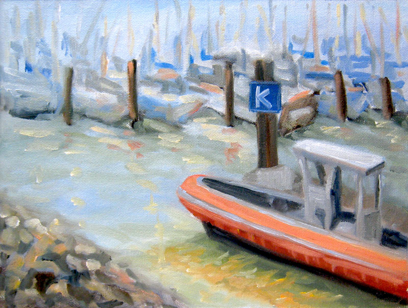
Oils on 9×12″ canvas panel
Larger view

In the interest of sharing my learning process in oils, I’ve posted this painting and some of my teacher’s critique. There are so many problems with this plein air plus studio painting that it seems to prove Dee Farnsworth’s saying, “Plein air is French for ‘bad landscape painting.'” I like to think of plein air painting as being the outdoor version of figure/life drawing — you’re trying to capture a 3-D live subject in real time, but with changing light.

The biggest problem is that it’s a painting of nothing…that is, there’s no focal point. In fact, the thing that interested me the most about the scene (some interesting branches) didn’t even make it into the painting. The composition basically sucks: there should be a path of dark values for the eye to follow but instead there’s a bright path leading nowhere: your eyes go up the path where you can turn left or right but there’s nothing there to see.

The shadows on the road don’t work because they’re too lumpy — shadows should be flat with softer edges. The daubing paint application is basically the same everywhere (I was trying to make myself use more paint–I tend to be too stingy with oil paint and was trying to work thicker). The foliage should be painted as masses–clumps of different sizes and shapes that go from dark underneath to light on top–just as you’d paint an apple–to give them dimension and form.

My teacher thought the painting was better before I messed around with it in the studio. Here’s the original done at the park (below):

Tilden Park Plein Air 1st

I’d gone out painting with my friend Susie who is much more experienced at plein air than I. When we packed up she pointed out that when we set up to paint, the Eucalyptus trees were light against a dark background, but as the sun had moved, the scene had reversed and the foreground trees were now dark against light background trees. I hadn’t even realized that but had unconsciously kept “correcting” my painting as the afternoon progressed which was not a good thing for the painting. It was best at about one hour. After that it just got more and more mucked up. When I brought it home I decided to work on it some more in the studio and lost a lot of what I’d originally liked about the painting which I didn’t realize until I posted both of them.

About knowing when to stop…I’ve always loved this story by Danny Gregory:

“When Jack was in preschool, there was one teacher whose class always did the most amazing paintings. Each one was clear and sharp and intelligent, Picassos in a sea of muddy fingerpaints. I asked her what she taught her kids, what she said to keep their visions so pure. She replied, “I don’t tell them anything, really. I just know when to take their paper away.”

Categories
Landscape Oil Painting Outdoors/Landscape Painting Plein Air Sketchbook Pages

Painting & Problem Begin with P

Alameda-Boat

Oil on panel, 12×9″
Click to see Larger

Yesterday I went out painting in Alameda with my plein air group. The view was delightful, the people were warm and friendly (both the group and the natives), the weather was nearly perfect and the city had actually blocked off a lane on the bridge (for construction–not for us) which gave us a perfect area to paint.

And I had nothing but problems. I’ve been reading several different books on oil painting and they all contradict each other. So I went out to paint with my head full of different approaches and with a goal to stop hoarding paint and put a lot on the canvas. Needless to say, the painting was a mess. After two hours I packed it up and watched a more experienced oil painter at work. I immediately saw where I’d gone wrong and decided that after the critique I’d go back out to the bridge and start over. But my feet hurt and I was hungry and the wind had really picked up so I decided to take a photo and paint at home using my first painting and a photo as a reference. One more problem…I’d forgotten my camera so had to use my cell phone’s crummy camera.

Here’s the photo which tinted the sky purple (which it wasn’t):

Categories
Art theory Landscape Oil Painting Outdoors/Landscape Painting Plein Air

Sunset View Cemetery- Oil sketch

Sunset View Cemetery Sketch

Click here to see larger
Oil on Raymar Panel 9×12″

Sadly I wasn’t feeling well enough to join the Benicia Plain Air Painters at Mare Island Friday and Saturday. I was fighting a cold (I won…after 12 hours sleep last night!). On Saturday it took me until 2:00 in the afternoon to get out of my jammies and into the shower, about the time the event was ending. Even though I still felt crummy the weather was beautiful (though windy) so I decided to try painting someplace closer.

The Sunset View Cemetery is quite nearby and has some lovely views so I headed up there. I drove around and around trying to find a spot to paint. Then I walked around, dragging all my gear, finally settling on this view. Unfortunately it was on top of the hill in the bright sun and very windy so I couldn’t use my umbrella to shade the palette and canvas, making color mixing tricky.

Even though I felt funky and tired, once I started painting all I felt was joy and pleasure. Then I ran out of steam after about 90 minutes, just managing to block in the lights and darks. I fiddled with it a bit today but wiped off all my fiddles. I decided I liked it just the way it is so I’m calling it a finished “sketch.” I may try making a larger painting from the sketch.

Value studies

Here are the compositional value studies I did first with Copic Markers (more about the markers). I meant for the tree to be further to the right like the bottom sketch but it ended up being closer to the middle in the painting.

Cemetery-value-comp

Alla prima in oils vs. watercolor

Two things that are important in working alla prima (all at once instead of in many layers) in oils and very different from my approach to watercolors are:

1) The importance of planning the composition (of course it’s important with watercolor too, but with watercolor you can crop off the bottom or side of a painting if you need to do improve the composition) . With stretched canvas or canvas panels it’s not nearly as easy as just snipping off the offending section or hiding it under a mat.

2) Getting the values (darks and lights) and the color right the first time. In watercolor I’m used to going for an approximation of the right color and then adding washes to make it darker, cooler, warmer, etc. In alla prima painting in oils I’ve learned I need to figure out the values first, then put down the darkest darks, and then the light areas for each main shape. Unlike watercolor, there’s no corrective glazing or washes when you’re working with wet gooshy paint.

Categories
Landscape Oil Painting Outdoors/Landscape Painting Plein Air Sketchbook Pages

Berkeley Marina & Guerilla Painter Pochade Box

K Dock Berkeley Marina in Oils

Oil on RayMar panel, 12 x 9″ (Click to see larger)

This is my first “official” plein air oil painting that I did at the Berkeley Marina this morning where I joined a group of local plein air painters. I’m so thrilled to have found them. We met at 10:00 and then  went off to to paint in different spots, getting together again at 1:00 for a lively critique. I got some very useful suggestions  (e.g. adjust the bottom line of the boats is straight across the canvas so adjust to more of a diagonal slantig down to the left). I noticed that very problem when I was working out my preliminary thumbnail/value sketches but I momentarily forgot about artistic license and left it as I saw it instead of changing it for a better composition.

Although I felt shy about being so unskilled at oils and plein air painting I felt very welcomed by the group. It was a beautiful sunny (but cool and windy) day in Berkeley with the usual assortment of nuts, hikers, bikers, families and local characters passing by who all stopped to offer supportive comments or tell me about an artist they know or have seen before. I was so pleasantly suprised — not one person said, “Ewwww! What a bad painting!” or laughed at me. I didn’t worry about that with watercolor but somehow with an easel and all the trappings I felt like I stood out more.

Plein air set up at Berkeley Marina
(Click to see larger)

This is my new Guerilla Painter 9×12″ Pochade Box Plein Air Easel set up and I love it! It holds almost everything needed for painting plein air and is sturdy and super fast and easy to set up. I’ve never been so impressed with a company’s customer service as I had at Judson’s Plein Air either. I had a million dumb questions in trying to decide whether to buy this “cigar box” style easel or a french easel or a Soltek (which I couldn’t afford anyway) and when I called (twice) I spoke to Monica, who patiently answered every question, gave great advice, way above and beyond the usual which was so appreciated by this novice plein air painter.

The box is incredibly well made, really beautiful and makes setting up to paint, painting and carrying wet canvases a cinch. They also offer watercolor and pastel and acrylic versions of this box in various sizes. The tripod has a quick release so you just set the box on it and it clicks into place, and is very sturdy. It has separate adjustments for height and leg spread (far apart for windy, rough, or uneven conditions). It comes with an attached “stone bag” (the black thing at the bottom) for putting something heavy on it to weigh it down (only necessary for gale force winds, I’d think because it was windy today and nothing budged or wiggled). Their Mighty-Mite Brush washer  jar is also wonderful. It fits in the box and doesn’t leak like every other container for mineral spirits I’ve found. The palette is in just the right spot as is the canvas with this box. I bought the plastic covered palette accessory which is a good addition. As someone who really appreciates good tools, I couldn’t be happier.

In the picture above on the right is my shopping cart I use for carting my plein air supplies around. It’s pretty practical although stuff can fall out the open spaces and picking it up is tricky since it tries to fold in on itself. I’ve ordered two different closed wheely carriers and when I get them will compare them all and pick the best for my purposes.

Thumbnail value sketch tools
(Click for larger image)

Above are the tools I used to make my preliminary thumbnail composition and value sketches. I recently discovered wonderful Copic markers–they’re fabulous — no smell and they blend and go on like silk. This handy composition/value finder can be opened to a marked setting for the size of paper or canvas. Then you close one eye and look through it to decide what to put in your composition. It’s middle gray so that you can also compare colors to it to determine if they’re darker or lighter. I used its opening to trace the rectangles in my Aquabee sketchbook so that the thumbnails would be the same dimensions as my canvas.

Categories
Landscape Life in general Other Art Blogs I Read Outdoors/Landscape Painting Plein Air Sketchbook Pages Watercolor

Towata Park, Alameda

Towata Park, Alameda

Ink and watercolor in large Moleskine watercolor sketchbook
Click here to see larger

Thursday night was a 2-hour plein air paint-out on Alameda Island that was part of the Frank Bette Art Center’s annual invitational weeklong event that culminates in a show and a fund-raising auction in the park Saturday. Susie and I went there straight from work and had a very enjoyable time looking at all the accomplished plein air painters at work spread out over about a half-mile square area. It was warm, very windy and the sun was setting on the water, creating glare amidst views of a marsh, the bay, a small boat harbor, San Francisco across the bay, and a huge old concrete bridge with rush hour traffic flying across it a very short distance away. Despite all these challenges, the artists were doing some amazing work. After we’d admired all the interesting styles and techniques we found a spot where we could sit and draw too.

We’d both been attracted to the funny little boat to the left of the picture so we both drew and painted the same scene (but quite differently) in about 20 minutes. Then we took another walk around to see the finished pieces and left as the artists were setting up their paintings in a circle so that they could vote on the winning painting. While we were there, I got to see Ed Terpening, a fellow blogger, in action (the painting he was working on last night can be seen by clicking his name), and met Tom Zephyrs, a fantastic artist who is the brother-in-law of a childhood friend. Susie and my favorite was a large pastel in brilliant colors of the imposing bridge by artist and blogger Ann McMillan. She won first prize at last year’s event and that pastel is featured on the Frank Bette’s website page about the event.

Two nights in a row of painting inspiration and two nights in a row of dreaming about painting…until the earthquake hit at 4:42 this morning, putting an end to lovely dreams for the night. Fortunately it didn’t create any problems and was short enough that I didn’t even have time to do my usual earthquake reaction: panic and try to remember what it is I’m supposed to do during an earthquake. It felt like someone had taken my one-story, rectangular house that is much longer one way than the other, and picked it up at one end and snapped it, like you do with a sheet when you’re opening it and laying it on the bed.

Categories
Flower Art Gardening Landscape Outdoors/Landscape Plants Plein Air Sketchbook Pages Watercolor

Tilden Botanical Garden

Serpentine Cone Flower

Serpentine Cone Flower
Ink and watercolor in large Moleskine watercolor notebook
Click here to see enlarged

Today I went to Berkeley’s Tilden Park Botanical Gardens with Richard. It’s a lovely, serene place filled with California native plants and trees from giant redwoods to wildflowers. He hiked around the hills, fields, bridges, creeks and wooded areas, enjoying the quiet breeze and birdsong. Most of the flowering plants had already done their big blooming in the spring but these coneflowers grabbed my interest so I sat down on the grass and did this quick sketch while Richard, a photographer, took close up shots of flowers.

Then we decided to move on to Blake Gardens. Richard had never been there and there were many parts of the estate I’d never explored, so we hiked all around there too, finding amazing jewels of nature and design at every turn. We took lots of photos but since time was limited and we wanted to see everything, I didn’t do another drawing. Now that I’ve seen the full scope of what’s there I think it holds promise for unlimited painting opportunities.

Categories
Flower Art Plein Air Watercolor

Irises Plein Air

Irises

Watercolor on Arches paper 12 x 9″ (scanner cut off inch on bottom)
To enlarge, click image, select “All Sizes”

I work from home Monday mornings and when we finished a conference call at 12:30 my boss said, “Bye Jana, now go have a nice afternoon painting.” So I did! But first I had lunch in my sunny backyard on the chaise lounge, eating a salad and reading a book on painting. Then I dozed off and had a lovely outdoor nap (I’m so much happier since I gave up being a workaholic!). When I woke up, I made a cup of coffee and got out my wonderful Valpod watercolor easel which I set up on the sidewalk in front of this bunch of irises in full bloom in my front yard.

irises in progress

Stopping point before moving indoors

I drew the irises in pencil and then quickly started painting since the sun had moved and the shade was quickly moving over the flowers. The roses behind them were already dark in shade. I got as far as the picture above before moving indoors for dinner. After dinner I worked a little more on darkening the background and negative painting around the stems and leaves, trying to suggest lots of foliage without drawing it all.

Categories
Every Day Matters Flower Art Gardening Plants Plein Air Sketchbook Pages Watercolor

Iris in my Garden (EDM: Fresh)

Iris in my garden

Watercolor in Canson 7 x 10″ Sketchbook
To enlarge, click image, select All Sizes

I’d planned to spend my painting time in the studio today but it was too gorgeous outside to stay indoors. So I pulled up a lawn chair and painted this iris in my front yard. I drew it in pencil and then added watercolor,  all the while listening to birds chirping (and the sounds of the nearby freeway which I pretend is the ocean), with the sun shining, the bees buzzing around me and the wind blowing my hair.

These irises are heart-breakingly beautiful. They are so fragile and temporary. One day they’re proudly blooming, thrusting their strong, wild purpleness proudly up to the sun and the next day they’ve turned to a little wisp of gelatinous film, drooping sadly from their stalk. I’m glad I was able to sit with this one for an hour and enjoy it’s beauty before it’s gone.

Categories
Outdoors/Landscape Plein Air Sketchbook Pages Watercolor

Cerrito Creek

Cerrito Creek 2

Ink & watercolor in small Moleskine watercolor notebook
To enlarge, click images, select All Sizes

Cerrito Creek 1

Today was a glorious sunny day — perfect for a mid-day walk to Peets Coffee. This is Cerrito Creek, a little urban greenway hidden away a block from Peets beside the California Orientation Center for the Blind and Albany Hill in El Cerrito. I got my coffee beans and an iced decaf latte and did these two little sketches.

It was a lovely spot except for the smell of dog pee along the fence I was using as an easel/table. This path must be a favorite dog walking spot. It’s funny how sensory experiences get embedded in a painting done outdoors — souds, wind, sun, friendly people…they’re all in there.

Tonight I tried adding a little Aquacover (a white-out designed for watercolor paper) mixed with some yellow paint to try to put back the falling water and reflections. I’m not sure it worked. Here it is before I added the splashy water.

Cerrito Creek 1

Categories
Plein Air Puerto Vallarta Sketchbook Pages Watercolor

More Puerto Vallarta sketches

PV-Fountain
PV-Fountain-white background

Watercolor in Canson 7×10 watercolor book
To enlarge images, click them and select All Sizes

PV-Grocery

Ink and watercolor in small Moleskine watercolor notebook

I struggled with painting this fountain that was outside our classroom. There was no direct light because it was in a roofed courtyard and there was a bright fuschia pink wall behind it and a bright yellow-green wall on its right side. Before I painted the background, the fountain looked great. Then I painted the wall bright pink and it overpowered the fountain so then I tried painting over it which didn’t work so I washed off as much of the pink as would come off using a damp brush, and then painted over it with yellow ochre. The second version is with the background removed in Photoshop, cropped and lightened a bit to try to recreate how it looked originally. Which do you prefer?

One good thing that came of doing the drawing was that I recalled a tip I’d heard somewhere: to make a cylindrical object like a fountain or a vase appear symmetrical: draw a light vertical line down the center first and then measure each section (measuring its width on one side by sliding your thumb down the pencil to mark the size) and then comparing it to the other side or just eyeballing it.

I drew the grocery picture in the supermarket a couple doors down from my hotel. A workshop friend and I were there to get photos developed at the in-store 1-hour photo booth (thank goodness for my Spanish–without it they would have printed all 104 pictures on my SD card instead of the 10 I wanted–I had to talk them through how to do it on their machine since there was no self-serve). We stood in the produce aisle with our pens, sketchbooks and little paint kits drawing and painting as fast as we could while shoppers and employees ignored us. The worker was standing on a raised rail changing the prices. Half of the price tags listed comparisons to Walmart prices to show shoppers they were getting a good deal. It’s not the charming street market I hoped to sketch, but they did have great fresh rolls in the bakery and organic lettuce and rotisserie chickens that I used for lunch sandwiches all week.