Categories
Art theory Outdoors/Landscape Puerto Vallarta Sketchbook Pages Watercolor

Puerto Vallarta Aeropuerto

PV-Airport-Control-Tower

The Control Tower at the Puerto Vallarta airport. A couple of guys in t-shirts in the open air tower were moving from side to side, looking around and then looking down at their computers (I assume).

PV-Airport

The view from the waiting area of the runways surounded by grass, bushes, the mountains in the distance and some beat up police vehicles parked in the tall grass.

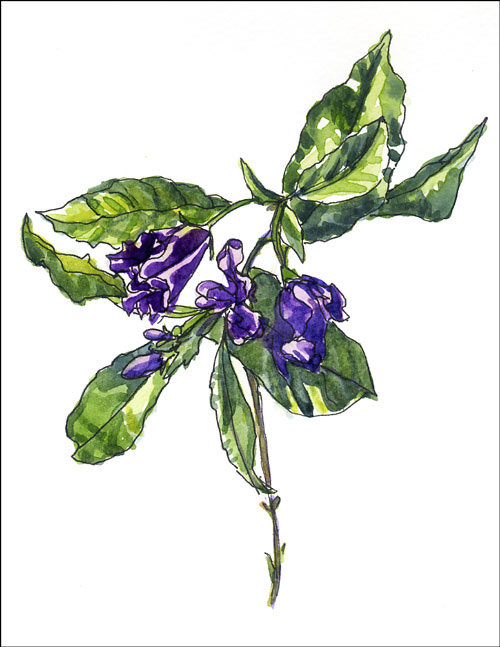
Ink and watercolor in small Moleskine watercolor notebook.
Click images to enlarge.

When I was leaving P.V. I was told to get to the airport 2 hours early. I got there even earlier than that and after a rudimentary search of my luggage and checking in, learned my flight was delayed an hour. The airport was hot and humid, with no air conditioning. I went upstairs and borrowed a chair from the burger joint to go sit by the window. When I tried to buy an empty cup to put water in for my paints they wanted $1.50 for the cup so I wandered over to the Starbucks and found someone with an empty coffee cup who was happy to give it to me. I washed it out in the bathroom and went back to my chair and finished the drawing.

I decided to go ahead through customs where they searched my carry-on backpack (and allowed me to take my empty cup and paints) and discovered another part of the airport that was air conditioned, modern, fancy and full of duty-free shops that might as well have been in NY or San Francisco. I found another window and drew the runway and then headed to my gate with a yummy ice cream on a stick coated with chocolate and almonds. I was both sad to be leaving and happy to be coming home.

Here’s a few more tips from the Judy Morris watercolor workshop:

Salting:

  • Morton Coarse Kosher salt works best
  • Tape paper flat to the table to avoid tilting and getting little star patterns…this technique is to get texture but not lighter starry areas.
  • Paint all of the salted areas of the painting first, finish all the salting, and then paint the rest of the painting.
  • Paint the area to be salted in little sections, areas no bigger than size of palm. The paint must be very, very wet. Pick up pinch of salt and rub between finger and thumb to drop it from about 10-12” above painting. Then paint next little area. Don’t let the shine go off the paint before salting and make sure there’s no clumps in the salt.
  • Leave little skipped white spots where you can add in a color from other areas of the painting to unify with them later when the salted areas are dry and the salt is removed.
  • Drop in darker paint along edges or between salt crystals or drop in a reflected color from adjoining areas (red into purple if neighboring area is red).
  • Blow off salt that falls into dry, non-salted areas rather than brushing it off to avoid scraping and damaging the paper.
  • Remove salt from salted areas by scraping that area firmly with a palette knife when very dry.
  • After removing salt, blot the salted area with a damp paper towel to remove any remaining salt or glaze the area with a light wash of yellow or another color to unify, soften edges and bring out a glow.
  • To glaze, use a flat 1″ brush and flick brush lightly in all directions, making x’s or asterisks.

These are her instructions…I’m just passing them along and I think this is the last of the PV drawings and notes from the workshop I’ll share.

Categories
Plein Air Puerto Vallarta Sketchbook Pages Watercolor

More Puerto Vallarta sketches

PV-Fountain
PV-Fountain-white background

Watercolor in Canson 7×10 watercolor book
To enlarge images, click them and select All Sizes

PV-Grocery

Ink and watercolor in small Moleskine watercolor notebook

I struggled with painting this fountain that was outside our classroom. There was no direct light because it was in a roofed courtyard and there was a bright fuschia pink wall behind it and a bright yellow-green wall on its right side. Before I painted the background, the fountain looked great. Then I painted the wall bright pink and it overpowered the fountain so then I tried painting over it which didn’t work so I washed off as much of the pink as would come off using a damp brush, and then painted over it with yellow ochre. The second version is with the background removed in Photoshop, cropped and lightened a bit to try to recreate how it looked originally. Which do you prefer?

One good thing that came of doing the drawing was that I recalled a tip I’d heard somewhere: to make a cylindrical object like a fountain or a vase appear symmetrical: draw a light vertical line down the center first and then measure each section (measuring its width on one side by sliding your thumb down the pencil to mark the size) and then comparing it to the other side or just eyeballing it.

I drew the grocery picture in the supermarket a couple doors down from my hotel. A workshop friend and I were there to get photos developed at the in-store 1-hour photo booth (thank goodness for my Spanish–without it they would have printed all 104 pictures on my SD card instead of the 10 I wanted–I had to talk them through how to do it on their machine since there was no self-serve). We stood in the produce aisle with our pens, sketchbooks and little paint kits drawing and painting as fast as we could while shoppers and employees ignored us. The worker was standing on a raised rail changing the prices. Half of the price tags listed comparisons to Walmart prices to show shoppers they were getting a good deal. It’s not the charming street market I hoped to sketch, but they did have great fresh rolls in the bakery and organic lettuce and rotisserie chickens that I used for lunch sandwiches all week.

Categories
Art theory Outdoors/Landscape Plein Air Puerto Vallarta Sketchbook Pages Watercolor

Color Chords

PV-Fountain2

Ink drawing with watercolor in Canson 7×10 watercolor sketchbook
To enlarge, click image, select All Sizes

I left the workshop to go sketch outside behind the classroom, sitting on a little brick wall along a road with trucks and taxis constantly parading past. This dry fountain was going to be torn down soon as it’s in one of the ubiquitous construction areas.

(More from my workshop with Judy Morris in Puerto Vallarta last week).

COLOR CHORDS:

This is important to me because I can get so involved in rendering exactly what I see that I forget to take artistic license to create a more pleasing color scheme rather than painting whatever colors are present. A color chord is like a chord in music–a selection of color notes that harmonize or are exciting together.

  • Most paintings accepted into the American Watercolor Society annual show have a limited palette
  • Avoid too many colors or abrasive color combinations by making a “color chord” plan before painting
  • Use a LIMITED PALETTE with any combination of the 3 primaries (a yellow including yellow ochre, a red and a blue); a complementary color scheme (2 colors opposite each other on the color wheel) or an analagous color scheme (neighboring colors on the color wheel); or· 1 color and sepia OR
  • Use a BORROWED COLOR SCHEME: Collect samples of from good photos, postcards, or other paintings color schemes you like and keep them in a folder. Select a color scheme from these samples to select a color chord for your painting.


Categories
Art theory Other Art Blogs I Read People Sketchbook Pages Watercolor

Focus!

PV-Beach

Ink and watercolor in Canson 7×10 Watercolor Sketchbook
To enlarge, click image, select All Sizes

I liked the Canson paper, it’s strong and very forgiving and heavily surface-sized — better than the Moleskine notebook — but not too thrilled with the colors I used in the sketch above in trying to use at least something the teacher suggested.

Puerto Vallarta Breakfast

Breakfast View – Ink and watercolor in small watercolor Moleskine
(to enlarge, click image, select All Sizes)

Breakfast at the workshop was at the open air buffet restaurant in our hotel, right on the beach, which was a lovely way to start the day, even if it was only half an hour after sunrise.

While I was drawing this a waiter came over to watch. I asked if he painted and he said he loved to draw but was unable to buy decent paint locally and mail order was impossible because Mexico charges 3 times the cost of the supplies in tariffs. He told me he draws pictures and then his 4 year old son colors them with crayons. He looked so admiringly at my little painting kit, amazed at what could be had in the U.S. I asked the class if they’d be willing to donate some paints for him and the teacher gave me her entire palette full of paint and three brushes. Other students gave watercolor paper and blocks. He was so grateful and everyone was really happy to have been able to help a fellow aspiring artist. I still feel happy remembering his sweet smile.

Tonight I spent the evening tonight typing up my pages of notes from the workshop. Here is one of most important thing I learned, which should be obvious but never really clicked for me before:

FOCAL POINT

I am often entranced by all the details in a subject and my paintings can suffer from lack of focal point or strong values. Forcing myself to chose a focal point BEFORE starting a sketch or painting and concentrating on values in that area at least, is going to make a huge difference in my approach and to the success of the painting.

  • A juror or curator for a show looks at each slide no more than 3 seconds and MUST BE ABLE TO SEE THE FOCAL POINT IMMEDIATELY. There should be the most contrast in that area (dark/light contrast or strong color contrast).
  • Before starting a drawing or painting, think about what interests you and attracts you to the subject and determine the focal point.
  • Put a painting in progress on the mantle and walk by it in the evening as the room gets dark to see if the focus is apparent
  • Hold the painting up to a mirror 10 feet away to look for problems with the drawing or painting, especially in portraits
  • Get the values right: Make a “Claude” mirror by spray-painting black the back of a sheet of plexiglass. It will reflect the image in values with the color neutralized. Or view the painting through red or gray film to show values without color.
  • She recommends as the best book on design in painting: “Probing the Hidden Order” by Marie McDonald Roberts.
  • Best spot in a painting for focal point is above horizon to the right because we read from right and up (this is the same spot as the “Divine Proportion” or “Golden Mean.”
  • To study focal points, very quickly go through a magazine putting red dots on the first thing you notice, then go back and study why your eyes went there. Usually contrast in value or color.

Next time I’ll post what I learned about Color Chords.

Categories
Life in general Plein Air Watercolor

Hasta la vista

easel1

I’m off to Puerto Vallarta, Mexico for a week of painting, swimming, reading and siestas. I’ll be joining Judy Morris for her watercolor workshops from 9-2 in our courtyard patio “studio” and on plein air painting trips around the area. The trip is sponsored by Flying Colors Art Workshops.

The picture above is my new watercolor easel recommended by Judy. Here’s what she said about it:

“Some of you may be interested in the PERFECT plein air easel. I have one! I ABSOLUTELY LOVE IT!!! Look at Valpod Artist Easel website to see it. Norm Kramer in Idaho makes them (Valpod Artist Easels – Telephone: 208-522-8677 in Idaho). I prefer the #U8000 model. I take the tripod, shelf, plastic cups that are provided, and the small (1/4 sheet size) board. Fits in my suitcase perfectly!”

I’ll let you know how I liked it. I normally use a Winsor Newton Bristol watercolor portable easel and make a shelf by clipping a flat old palette on top of my old lady shopping cart that I drag my plein air supplies around in. I can’t bring that cart with me so will have to carry everything, which I’m not thrilled about. I may just use my watercolor sketchbook when we go off site. I’m bringing a Canson Montval Field Watercolor notebook (140 pound watercolor paper 7×10″), small Moleskine watercolor notebook and sketchbook in my backpack on the plane, and maybe a few others, depending on room.

Well, it’s already 9:30 PM and I haven’t finished packing yet and I’m leaving in the AM so I better say Adios now.

I’ll be back next weekend.

Categories
Life in general Watercolor

Getting ready for Mexico

I’m getting ready for my painting trip to Mexico with lists of things to take care of before I leave on Saturday morning. I’m trying something new–starting to relax a little before vacation instead of pushing up until the last minute, which has always meant starting a holiday with a migraine.

Tonight my painting time is being used to prepare my palette for the trip so no art, but here’s a picture of my plein air/travel palette which I’ll be packing in my suitcase. The piece of painted watercolor paper beside it serves to remind me which colors are which and also serves as blotter paper in case the paints drip. It fits inside over the top of the paint. I use this palette regularly for plein air painting when I’m setting up an easel.

Plein air and travel palette

9 x 11″ Holbein palette that folds to 9×5.5″

This is the cheapie palette I’m going to take on the plane with me so I won’t be upset if it gets thrown away (thanks to Belinda Del Pesco for the idea of taking a cheapie onboard in case security puts it in the bin with the other dangerous items, like toothpaste and hand lotion.) I bought this to try it out for about $4.00 and didn’t like it much but it’s handy as a loaner for students.

Cheapie palette to take on plane

8×8 cheapie palette, folds to 8×4″

While I’m at it, I thought I’d throw in pics of my other palettes that I use on a regular basis. This is my standard studio palette. It has a lid to keep the cat hair (and cat paws) out and I like it a lot. I have all of the paint names and pigment numbers marked around the outside edge.

Studio palette

15″ x 11″ Robert Wood studio palette

And here are two little palettes. The one on the left is an ancient Holbein palette with some of the original paints and some that I’ve refilled with new colors. I keep it in my backpack along with my little sketchbook for times when I’m not planning ahead to paint but want something small and flat to carry along just in case. It sat on my desk at work for a long time, begging to get used but only did once. I keep the Winsor & Newton on the right in my little grab-and-go kit that I use when I’m planning to paint in a cafe, at the farmer’s market or in my car — somewhere I wouldn’t use an easel. It’s very handy and portable, since it has a little water container (that dark thing at the top) as part of the kit. They both have little finger loops on the back so that you can hold them comfortably and mini brushes, though I use Niji waterbrushes for painting with them since they have handy tops to protect the brushes.

Holbein & WN little palettes

Schmincke folds to 3×5″ and Winsor Newton folds to 2.5″ x 4″ but it’s chunkier.

Categories
Flower Art Sketchbook Pages Watercolor

Potato Vine for Anne Dowden

potato-vine2.jpg

Drawn in ink and watercolor from “live specimen” (picked from my tree)
Solanum wendlandii AKA Potato vine or Divorce Vine

I LOVE THIS QUOTE: “Hers was a life of friendship by correspondence.” (Said about botanical artist and author, Anne Ophilia Todd Dowden, who died recently at 99. “She never worked from photos, only live specimens. When certain things were in bloom you didn’t see her. She knew a lot of people but she wasn’t that social. Hers was a life of friendship by correspondence,” said her friend, Lotte Blaustein.

I can relate. I treasure my friends and family but see them infrequently, instead staying in touch by e-mail or phone calls — a friendship of correspondence. The quote makes it sound elegant instead of something one should apologize for (as I’m always doing). The people in my life understand my need for solitude and are supportive of my passion to paint, but I wonder if I’m doing them and myself a disservice.

What do you think? Do you feel torn between preserving time for your art and others’ desire to have your company and attention? Or do you thrive in the company of others and it feeds your art?

P.S. Do you like this new blog template better than the previous one? I thought the type was easier to read on this one and it’s simpler without the blue on each side.

Categories
Every Day Matters Life in general Sketchbook Pages Watercolor

Pilates Reformer – EDM 103 (again)

EDM 103 - Pilates

Ink & watercolor in Aquabee 6×9 Sketchbook

This week’s Everyday Matters challenge is to draw your exercise equipment so yesterday and today that’s what I’ve done. I drew it directly with a pen which is why it’s not proportioned properly but I told myself to just be playful and draw for fun which I did.

This is my Pilates reformer plus various associated exercise gear in my exercise room. I have lots of exercise equipment and I used to use it faithfully for at least an hour every day until I started blogging. Since then my exercise time seems to have transformed itself into blogging time just as my muscles seem to be transforming into blogging blubber.

At least if I was doing an art/walking or art/bicycling blog like two of my very favorite art bloggers, Julie and Alison, I’d be doing art and getting fit at the same time. I think the only solution is to go to bed earlier so I can get up in time to do an hour of exercise again before work. So I’ll end this here and get to bed so tomorrow I can get up early and workout.

Categories
Every Day Matters Sketchbook Pages Watercolor

Maidenform

Maidenform

Watercolor in large Moleskine watercolor notebook
(To enlarge, click image, select All Sizes)

Well, I don’t know what could be more ordinary and every day than an undergarment or more odd than publishing my underwear on the internet… but I was so tired today after a really busy day yesterday that I couldn’t muster the energy to look further than my laundry basket for a subject to sketch. I asked Michael if he could tell what it was a picture of and he guessed “Um….Onions?” Oh well…I know it’s not great but it felt good to spend a little time at my drawing table and get something posted after a couple days away from the computer.

Alison’s wonderful sister is visiting San Francisco from Australia and I had the pleasure of spending the day with her yesterday. I picked her up at her hotel in North Beach (not a beach–it’s the “Old Italy” part of San Francisco, former home of the Beat poets), spent a few hours at the new DeYoung Art Museum in Golden Gate Park, then drove out to Ocean Beach where we took a stroll on the beach. The weather was lovely, much nicer than the last time I was there last summer when it was foggy, windy and cold. Then we headed back to North Beach where we spent an hour browsing in the City Lights Book Store. I bought two good books to bring with me to Mexico in two weeks. When we got hungry we walked to nearby Chinatown for a delicious dinner, then back to North Beach to say good-bye.

After all the driving yesterday, including getting quite lost a couple times thanks to really bad directions from MapQuest which I vow I will never use again, today was about staying home and taking it easy.

Categories
Every Day Matters Life in general Sketchbook Pages Still Life Watercolor

More Soap (EDM #101)

Dish Soap (More EDM #101)

Watercolor & Ink in Moleskine watercolor notebook 6×9″
To enlarge, click image, select All Sizes

I keep my dish soap in this squirt bottle originally meant to mix and apply hair dye. The glass plate is on loan from my sister. When I saw it at her house I begged to borrow it to paint it. I wanted to include it in yesterday’s soap picture.

I was supposed to be doing other stuff tonight but was getting really grumpy not being able to draw or paint so after helping my son with his resume, I abandoned the art business stuff I “should” have been doing. I drew this quickly with ink (hence the goofy edges and lines) and then added watercolor, thoroughly enjoying myself for the first time all day. Well, that’s not true. We did have some fun at work at lunch today, talking about our favorite “guilty pleasure” tv shows, but the rest of the day was just work, work, work.

To end this post on a happier note than the above whining, I’ll mention two things I’m grateful for.

1. I didn’t have a headache or a backache today and I noticed that several times during the day, making me feel grateful each time.

2. Yesterday I realized that even though I get frustrated with my lack of skill when painting with oils and acrylics and want to be good at it NOW, in a year, if I keep practicing and studying, I’ll probably feel pretty comfortable with them and maybe even competent. Or maybe I’ll realize I need another year of practice and I’ll take it. Same with drawing…if I keep at it, in a year, I’ll be a lot better at it than I am now.

Simple stuff, but it makes me happy.