 – – –
– – – 
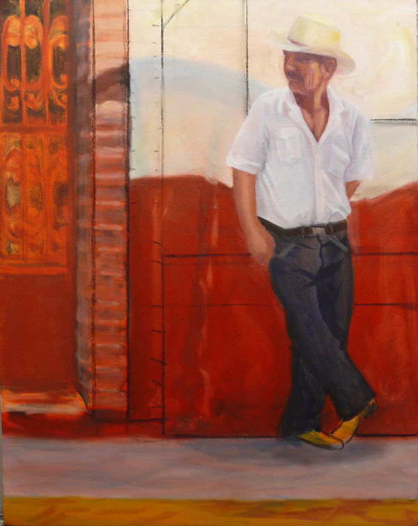
Larger — — — — — – — — – –(Revised version)- Larger
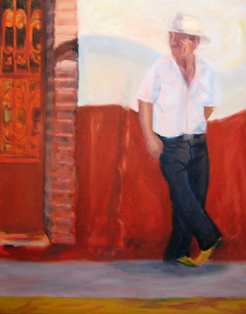
(Earlier version w/charcoal lines)
I knew there was something wrong with the composition of this painting in progress that I started in July but I wasn’t sure what the problem was. I studied it yesterday and realized that my eyes kept going to the blank area on the ground between the brick column and the guy’s feet. I was thinking about adding a box or something to the painting in that spot but then Elinor stopped in with Robin and pointed out that the problem was the weak contrast around his head where it’s all white against white and doesn’t draw your attention and is competing with the strong red area and contrast at the bottom of the wall where a white crack serves as an arrow to the ground.
To fix the painting, I decided to add more contrast around the guys head and break up the space/negative shapes in the composition. I experimented by drawing lines in charcoal seen in the picture on the left. Then I painted the blue square behind his head (that will have white lettering added to it instead of the blue lettering on a white wall in the original photo) to add contrast and make his face the focal point it should be. I also added a second column of bricks, lowered the red paint area on the wall and added an ochre band on top of it, and lightened the sidewalk.
I have a hard time finding the problems in my own paintings though I can usually spot them a mile away in someone else’s. I need to make a checklist of questions to ask myself about a painting when I have that uneasy feeling and don’t know why. Any suggestions welcomed as there’s still a way to go on this one.

7 replies on “Work in Progress – Puerto Vallarta Cowboy”
THIS IS FABULOUS!!!!!!!!!!!!!!!!!! I LOVE THE STANCE AND THE COLORS!!! BRILLIANT!
LikeLike
Without my “seeing” (as opposed to “looking”) glasses, his left foot seemed to be off the ground.But, glasses on, I see you’ve charcoaled that area for attention. So I should have another cup of coffee and be quiet!
LikeLike
Jana – you also might want to try covering his feet up with something dark just to see the effect on the rest of the painting. The light/dark contrast draws the eye also – and I’m not quite sure whether that’s what you intended.
LikeLike
That previous comment was really me – making a complete hash of leaving comments at 7am in the morning! I plead tea deprivation!!!
LikeLike
Thanks for the suggestions. I haven’t even painted his boots yet. This is really still in a fairly rough draft format. I’ve gotten some additional advice from my painting mentor that may take me back closer to the original painting. It’s so great having the support of other artists in this process.
Jana
LikeLike
I really love how this painting is coming along, Jana!
LikeLike
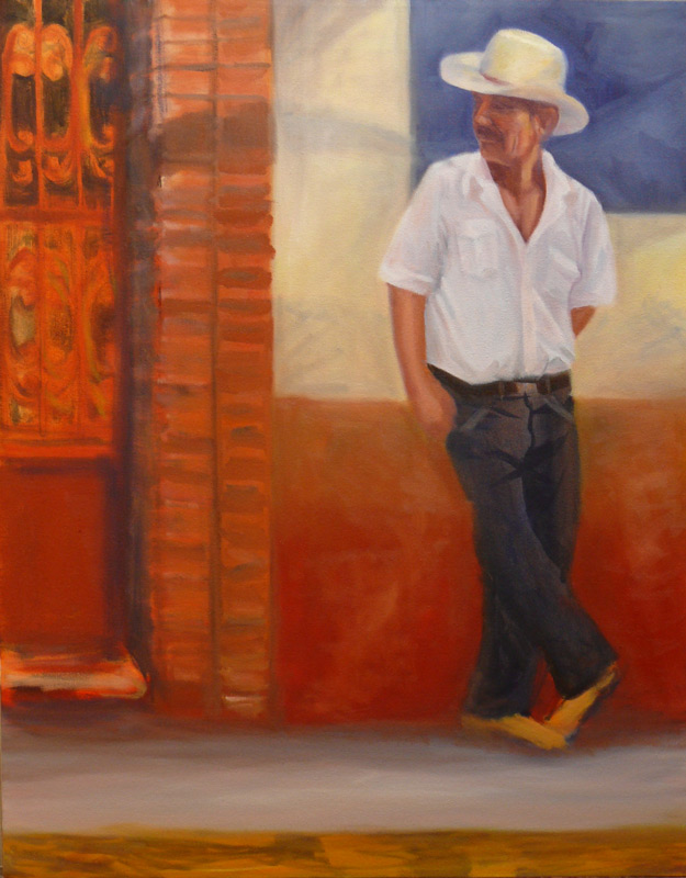
What a difference the blue square makes! The lowering and softening of the wall have also done wonders but the blue square works so well I just had to say, “great job”.
LikeLike