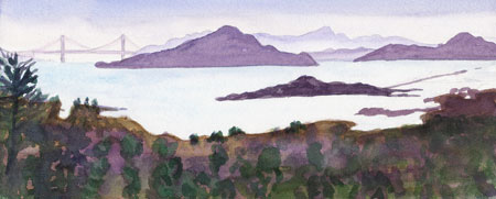
Ink drawing with watercolor in Canson 7×10 watercolor sketchbook
To enlarge, click image, select All Sizes
I left the workshop to go sketch outside behind the classroom, sitting on a little brick wall along a road with trucks and taxis constantly parading past. This dry fountain was going to be torn down soon as it’s in one of the ubiquitous construction areas.
(More from my workshop with Judy Morris in Puerto Vallarta last week).
COLOR CHORDS:
This is important to me because I can get so involved in rendering exactly what I see that I forget to take artistic license to create a more pleasing color scheme rather than painting whatever colors are present. A color chord is like a chord in music–a selection of color notes that harmonize or are exciting together.
- Most paintings accepted into the American Watercolor Society annual show have a limited palette
- Avoid too many colors or abrasive color combinations by making a “color chord” plan before painting
- Use a LIMITED PALETTE with any combination of the 3 primaries (a yellow including yellow ochre, a red and a blue); a complementary color scheme (2 colors opposite each other on the color wheel) or an analagous color scheme (neighboring colors on the color wheel); or· 1 color and sepia OR
- Use a BORROWED COLOR SCHEME: Collect samples of from good photos, postcards, or other paintings color schemes you like and keep them in a folder. Select a color scheme from these samples to select a color chord for your painting.


