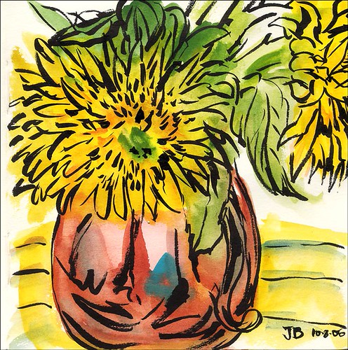
This was the last of the four little paintings I did tonight.
Kremer Pigments watercolors painted loosely, without drawing; then Pentel Brushpen with black ink loosely drawn over the dry paint. In Handbook Journal Co. square 5.5 x 5.5 sketchbook (purchased from Wet Paint in Minnesota) .
To enlarge, click image, select all sizes)
Today was a gorgeous summery day in the Bay Area and I spent it with a migraine, covers pulled over my head, wearing a sweatshirt over my flannel pajamas, with my electric blanket turned on, waiting for the pain to subside and my cold body temperature to return to normal. Finally around 6:30 tonight I felt OK enough to do something enjoyable and headed to the studio. I decided to experiment with some new art toys and a copper pitcher filled with sunflowers that I’d used as a set up for my watercolor students on Saturday morning.
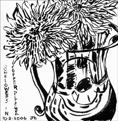
First sketch: Ink (Pentel Brush Pen) in square Handbook Journal
(to enlarge, click image, select All Sizes)
I did this ink sketch above as a gesture drawing to warm up. I’m loving the Pentel Brush Pen with black ink that I used in the two images above–basically a waterbrush with an ink cartridge. Unfortunately I was sent the wrong one–this one is not waterproof or lightfast, so I need to get the one Roz Stendahl recommended: Pentel Pocket Brush pen with the letters GFKP on it. That one IS waterproof and permanent.
The Handbook Journal Co. sketchbook was also recommended by Roz as an alternative to Moleskine watercolor notebooks. I give it a wholehearted thumbs up! It took ink and watercolor very well, and has all the other nice features of the Moleskine notebooks (elastic strap, hard black cover, back pocket, nice paper; however the pages are not perforated). They come in many different sizes and configurations and have more pages than Moleskines. I really like this square shape.
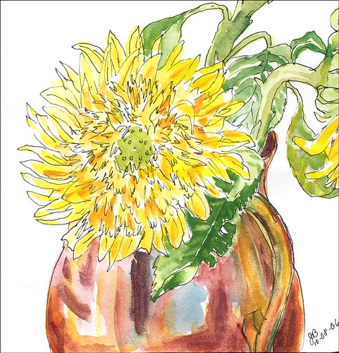
Third sketch. (Click image, select All Sizes, to enlarge)
Above is the third version I did, first drawing with a Micron Pigma pen in square Handbook Journal and then painted with Kremer Pigments. I worked much more loosely than the second one I did. I like the way the leaves and pitcher turned out. (I decided not to post the second one since it’s icky and overworked–if you have to see it I’ll leave it on my Flickr as Sunflower2.)

27 replies on “Sunflowers and Copper Pitcher”
I really like these Jana. My fav is the top painting…love the bold lines and the copper vase is wonderful!
LikeLike
Great effect on the copper – I like how you captured the glow!
LikeLike
I love it! I think my favourite is picture three.
LikeLike
Jana! First off, I hope your headache is better!! The weather here has been so changeable that I too had a sinus headache all day and felt like I was in a bowl for the most part. Now — your sketches!! KAZAME!!!! they are fantastic!! I LOVE LOVE LOVE the 4th — loose, yet enough line for detailing! OH HOW I WISH I COULD LOOSEN UP like that! The copper is filled with light and color and the sunflowers are amazing!!!
Tell me more about the new watercolors you’re using!!
Again, Jana — headache and all — these are fantastic!
LikeLike
How dilligent of you to experiment like this and it’s obviously so productive. I especially like the dramatic look of the last one. Well done.
LikeLike
Nice job. It’s interesting how different they all look. I’m a number 3 fan myself. Also, thanks for the info about the sketchbook. I’m going to try one out.
LikeLike
Jana- Where did you get your sketchbook? I just tried doing a web search, but can’t pull up anything.
Thank you!
LikeLike
those colors are so luscious! Love them all.
LikeLike
Beautiful work! I love my brush pens, too—you somehow feel that they are doing the drawing for you! Lovely, lovely sketches.
LikeLike
Great!
Sugoi!
I enjoy.
I think that all three patterns are good.
LikeLike
So spectacular! I think my favorite is the last one posted… but they are all fantastic.
LikeLike
I like the top one on the page the best. It’s so fresh and lively, it makes me smile.
LikeLike
Suzanne, There’s a link under the first picture to the store in Minnesota that’s carrying the journals in the post–Wet Paint is their name and since they just started carrying them they aren’t on their website yet. You have to phone them. I couldn’t find the journals on the web either.
Lin, Kremer Pigments are really amazing. They are so lush and rich and vibrant. But they’re also rather opaque and sedimentary–quite different from my usual transparent palette. You can buy a set of pans in a nice metal pallette only from Kremer in New York (link in post) for around $58 I think. They’re very interesting to experiment with, especially as an addition to your current pallette.
Jana
LikeLike
This is interesting to me as i’ve wanted to try doing w/c with pen-and-ink for awhile now — just haven’t done it yet. Have you ever done it the other way around? i.e. the ink drawing first and then the waterolour? If so, what are the differences in process/result?
PS I love your Trouble drawing!
LikeLike
Shoot. I didn’t read the explanation attached to the last sketch properly (bad habit), so that answers my question! 🙂
LikeLike
Jana, The flower painting is so beautiful. Light and AIRY just right for the wea
ther changes were having.
Have a great day.
Linda.
LikeLike
all 3 are fabulous but i love ink (pentel brushpen) one the most 😛 i too have the waterproof one. need to pull it out of hibernation. at one point in time it went everywhere with me in my handbag along with my sketchbook. and i had a second one filled in with a pale brown ink wash. A couple of other pens have taken over since.
LikeLike
Oh man! That last one is WICKED AWESOME! I just LOVE IT!. I love the colours – the blending of the yellow/green, I love the black in highlights and the way you did the lines of not even widths but sort of oriental inkbrushy way and I love the highlights.
I know people who – if they had this – would redecorate an entire room around it. 🙂
Great job! Cheers!
Mary Ellen
LikeLike
I love them all! And you with a recovering headache, oh my goodness. These are just spectacular. Now I need to find this sketchbook also!! Thanks.
LikeLike
Ahhh, Jana, I am sorry you spent such a beautiful day so miserable! I love the third take on the copper pitcher with sunnies in it. Of course, we had to check out the one you don’t like, which isn’t bad either, but I do like this one better! Beautiful job capturing those colors in the copper! I ordered Jacqui Morgan’s book from Amazon yesterday. Looking forward to perusing it.
LikeLike
I really like the top one, great colors and lines! BTW we were in San Francisco for the first time about a month ago…I loved it so much, what a great place to live and do art!!
LikeLike
Jana, these paintings are wonderful, i really like all three versions.
LikeLike
Jana I love the top one but I also like the bottom one, both so different but the colours of the top one – yummy. ?Wish we could get the sketchbooks and supplies in Oz that you can get, sigh, and your dollar is not good for us either. I like the sound of your square sketchbook.
LikeLike
I agree, the last one you did was great! However, the black and white was just as wonderful in its different style.
LikeLike
They all are beautiful, but the top one is my favorite!
LikeLike
I’m sure you mentioned it at somepoint, but again was wondering how you like the Kremer paints? Love the loosness of the sketches with the brush. Kind of freeing!
LikeLike
Hi Toni,
I like the Kremer pigments, but they are very rich, brilliant, opaque and sedimentary. It’s a little like eating something very rich and elegant–wonderful for special occasions, but not to easy to take on a regular basis. I’m still experimenting with them and they are fun for getting loose and going for it. They remind me a little of inktense colored pencils, though much better. The color sort of explodes into bloom and can easily overwhelm or overpower more delicate colors.
LikeLike