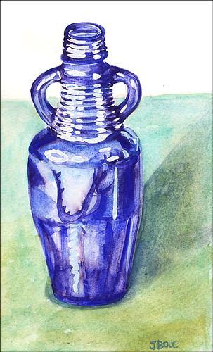
Kremer Pigments watercolors in large Moleskine watercolor notebook
(To enlarge, click images, select All Sizes)
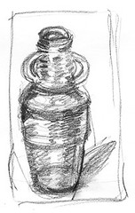
Quick value sketch before painting
I wanted to play with monotypes tonight but was too tired after working all day so decided to do a small watercolor sketch instead. I don’t know what this bottle held originally–nothing fancy, I’m sure. But I just love it’s proud stance, and hands-on-hips attitude. I found it at Thrift Town, a sort of thrift shop department store where I’d gone looking for a used doctor’s lab coat to wear while painting in oils to protect my clothes. They didn’t have any lab coats even though they said they did on the phone. Instead I found a soft denim old lady’s house coat in the bathrobe department which works perfectly and looks more like a traditional painter’s smock.
I used Kremer pigment watercolors for this painting even though I knew they weren’t quite the right choice. My regular Winsor Newton cobalt and ultramarine blues would have been more appropriately transparent and glowing, but I went with the more opaque and sedimentary (or is it flocculating?) Kremer pigments, just to see what would happen. They’re fun to work with and after several layers of glazes, gave the background an interesting texture. The Moleskine paper was pooping out though, starting to pill and dissolve so it was time to stop messing around and go to bed.

8 replies on “Blue Thrift Shop Bottle”
It’s interesting to see the value sketch – it really shows how they help to get the paint version right. A beautiful rendering of a difficult but delightful subject. At least it stays still.
LikeLike
AWESOME! I love that blue color and the reflections!!! I’ve not had much luck with my value sketches, although studying posts like yours with the before and after sure helps a lot! GREAT JOB, Jana!!!
LikeLike
Gorgeous color and the reflections are awesome. And you are right! It does like hands on the hips. Neat.
LikeLike
Jana, I LOVE this bottle , I also just love wc glass work. May I ask, did you mask out the whites and start washes then? I want to try a bottle but do not know where to start. If you don’t mind I may try to emulate your bottle.
Sandy
LikeLike
You got the glistening look of glass really well on this one, even if you say the paint is not as good as the W & N watercolours I think it glows.
LikeLike
Sandy: Yes, since I was working with a small format and in a hurry to go to bed, I did start with masking–if it was larger I would probably have just painted around the white areas. After masking I just started painting shapes of color that I could see. Doing the sketch first helped me understand what I was seeing and where the darkest areas and lightest areas were. When I paint glass I usually look for little shapes within the reflections and paint them one at a time, exaggerating the colors I see a bit to make it more interesting.
LikeLike
Jana – you have been busy. Your bottle must have been quite a challenge. The shape isn’t an easy one, and reflections on top of that.. you did a great job.
LikeLike
Love this Jana! You handle strong colours so well. Did you leave the highlights or use masking fluid?
LikeLike