Ink & Watercolor in Large Moleskine Watercolor Notebook
(To enlarge, click image, select “All Sizes”)
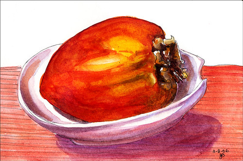
It felt like time to get back to some color tonight and this persimmon was a willing victim for a quick little study.
I stopped at the art store on the way home from work tonight and ended up spending too long (and too much money), gathering oil painting supplies and learning from a knowledgeable employee about improvements in oil painting materials since I last used them 20 years ago, and how to work with the new safer mediums and solvents–no more turpentine. I remember being in an oil painting class at SF City College in a room without special ventilation, with 30 students all having open containers of turpentine and paint thinner. By the end of class I’d feel like I was drunk–just one of the many reasons I seem to have so few functioning brain cells these days, I’m sure!
It felt weird buying white paint, since in watercolor one tries to save the white of the paper for areas that are to remain white. With oils you can add a highlight or a light area at the end of the painting, which rarely is successful with watercolor, unless you don’t mind opaque paint on top of a transparent watercolor.
My plan is to try to use the oils like watercolors, glazing in layers. I’m certainly not planning to give up watercolor, but every now and then there’s something I’m painting that seems to want to be more opaque and have greater depth.

12 replies on “Persimmon in Spoon Holder”
Wonderful – the bowl, the cloth, the persimmon all work wonderfully together.
LikeLike
INCREDIBLE!!! SO VIVID — WITH JUST THE MOST PERFECT BIT OF INK!!! LOVE LOVE LOVE IT!!! I CAN SEE THIS ON A GREETING CARD!! SUPER SUPER SUPER!! HOPE YOU ATE THAT BEAUTY!
LikeLike
Wow, those colors just knocked my socks off. Gorgeous! Love the persimmon in the dish and how the colors all relate to each other.
LikeLike
Another great display of your ability to use color, Jana. The shine on the persimmon makes it so appealing.
LikeLike
Wow, Jana! The color depth in this is incredible!
I know what you mean about looking for colors that are more opaque
LikeLike
I really can’t wait to see what you are able to accomplish with oil paints. I’ve never tried them; in fact, they scare me a little. But, perhaps I will be encouraged by your effort!
LikeLike
Full and rich colors, great! I too am eagerly awaiting your oil paintings!
LikeLike
arleta pech has a web site. She switched to oils but paints them like watercolor. I think she has some information about this on her site.
LikeLike
oils scare me enormously too. my nephew uses them a lot, he’s pretty good with them too, but i never have. I’m only now starting to use watercolours.
Great persimmon by the way. i always wondered what a persimmon was.
LikeLike
Jana, reminds me of Florida which I lived for so many years. Thank-you for the Palm tree it’s wonderful.I live in grey Pittsburgh and after living in fla it hard to get adjusted. Even though I’ve been hear for some time its always grey to me in the wintr months.
Linda
LikeLike
the colors are so brilliant, the persimmon so bold but also the more subtle shadows on and below the dish, wonderful!
LikeLike
That was a “quick little study”? Its GORGEOUS!
LikeLike