
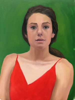
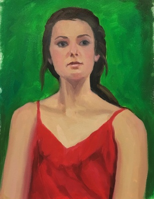
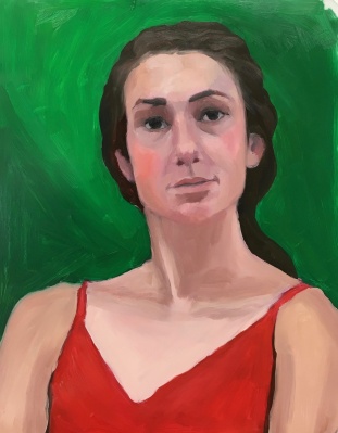
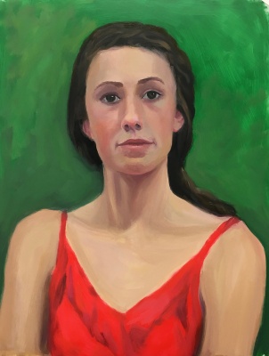
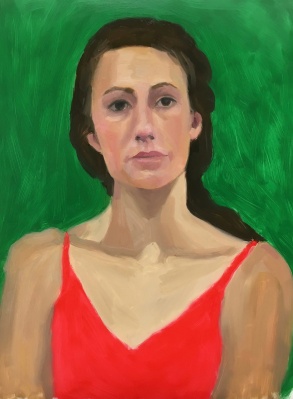
Usually I pick the one image that I like the best to put at the top of my posts but after doing this exercise six times, I don’t know which, if any, I like at all. My struggles and mood on the day I was working on these studies really came through in the images. Each portrait seems to be saying what I was feeling, from “WTF!” to “I’m confused” to “Erk!” to “Help! Get me out of here!” To “Maybe it’s time to move on.” More about complementary colors and what I learned from this exercise after all the awful paintings below:

The goal of the Complementary Color part of the New Masters Academy Color Boot Camp is to work with different pairs of complementary colors under different lighting conditions and observe the way the colors interact, both visually in the image, and when mixing together on the palette. Complementary colors are clearly explained this Wikipedia page.
The easiest way to remember which colors are complements are to think of the triad of the three primary colors: red, blue and yellow. Pick a color; the missing part of the triad is its complement. If you pick green (composed of blue and yellow) then red is missing. Red and green are each other’s complements. Pick yellow and what’s missing? Red and blue. When combined they make purple. Therefore purple and yellow are complementary colors. Ditto for orange (red+yellow) and blue.
Things I noticed: Red and green, like all complements, when beside each other make each other look brighter, more vibrant. When mixed together they dull each other down and make a grayed color. I really struggled to get a likeness, and even though that isn’t the point of the color exercises I got determined (obsessive?) until I finally gave up. Flat, frontal lighting makes it hard to find landmarks and planes in the face.
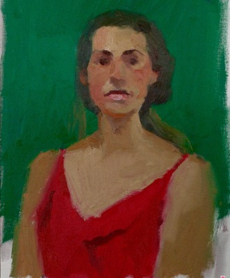
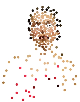
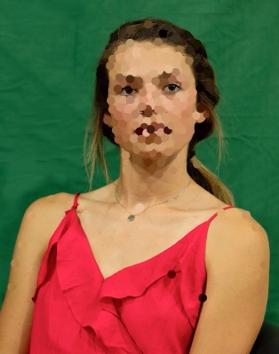
The last images are of the original photo reference, the teacher’s painting and two Photoshopped pictures where I selected color spots on the reference photo using the eyedropper tool and painted a spot of that color on a layer above the photo layer (displayed here with and without the photo). I do that when I have trouble recognizing what colors I’m actually seeing. I never really nailed any of these, in likeness or color. But the next exercise came out really great and I’ll post that soon.

9 replies on “Color Boot Camp Part III: Complementary Colors, Red/Green #1”
I love the face, colors, look, and more in # 1 and #2, but #4 looks most like the model, who is very pretty! God bless, C-Marie
LikeLike
Thanks! I think agree with you.
LikeLike
I love the way you have repeated your process – very cool! Thank you so much for sharing your work!
LikeLike
Thanks! I get very persistent and determined to “get” it. I keep trying until I either get it or get really tired of it and then I’m happy to move on.
LikeLike
I’m so loving to watch this course progress and am enjoying the lessons by proxy. Not having had the opportunity to attend fine arts courses and ateliers when I was young, your blog is vies me an idea of what it would have been like. You are an exemplary student!
LikeLike
Thanks Gaelle. I’m not young myself and never went to an atelier though I did take lots of art classes in college and have taken workshops with the some good teachers. This work is being done by video from an online art school: New Masters Academy. Anyone can join and they have classes for beginners through advanced.
LikeLike
It was interesting to see someone else use photoshop to try and achieve facial colours. I think because the colours in skin are not flat but a multitude of colours it did not work well for me when I tried it and reverted back to look, look, looking, but it was an interesting exercise. Did you get the same thing or did you feel it worked for you? Portrait 4 to me looks more like the model but myself prefer the colours in portrait 1. Thanks for sharing, I found this it very interesting .
LikeLike
Thanks Janette. I do find it helpful because it brings me to a more realistic view of the skin colors which are almost always surprisingly neutral, grayish and usually darker than I expect, especially in shadows. I tend to want to go for pinks and oranges when it’s really more beige or even greenish or dark chocolate color.
LikeLike
Thanks Jana, yes I did notice that the colours were a lot darker than I expected too, which was an eye opener. I did read some where by another artist that the orange, yellow and pink was a big colour for white people and have notice the browns of shadows are quite dark but maybe it really it comes down to lighting and bounced lighting from objects as well. Oh well back down to experimentation . Thanks and love to see what you are doing.
LikeLike