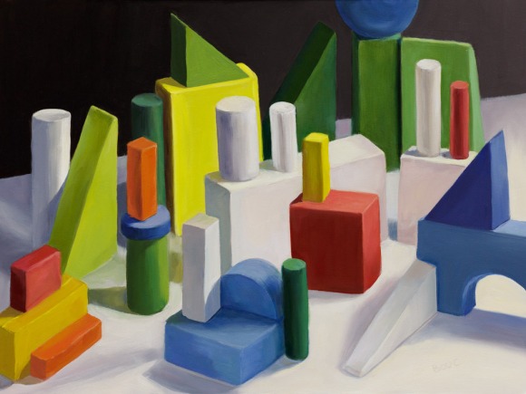
I wanted to learn how to get from a grisaille underpainting to a full color painting after I did the Frankie Flathead monochrome study. So I decided to set up some colored blocks as if they were a landscape, and paint them in layers, starting with a grisaille, trying to find a method that worked for me.
Above is the final painting and below is the step-by-step process that I followed.

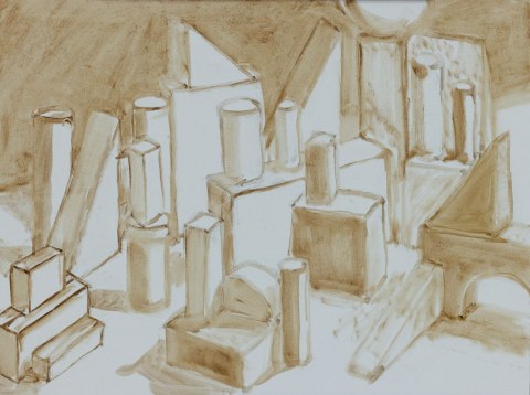
I used the wonderful Nitram vine charcoal to sketch first, trying to get everything in the right place and the right size. I lightly dusted off the charcoal and restated the lines with a brush and thinned paint. Then (above) I used that thinned paint to block in values, shapes and shadows, keeping them fairly light and leaving white and light areas unpainted.

Although grisailles are usually done in one color (grey, brown or dull green), I decided to use limited color (red, blue, yellow) for the “closed grisaille” (opaque paint) layers. I was still focusing on value, just blocking in the shapes with paint closer to the local color of the object. After I finished the first layer I checked to see how close I was to the correct values.

I took a photo of my block set up and a photo of my painting, and in Photoshop converted them to grayscale and placed them side by side to compare (above). Then I used Photoshop’s Custom Shape Tool and eyedropper to sample the shade from the photo on the left and paint on the photo on the right. The spots where the little blobby shapes blend in or disappear is where I got the value right. The ones that stand out show the needed value correction.

I did another layer where needed to correct the values (above). Then I could move on to paint the colors as I saw them. I mixed a color and tested a dab on the painting to make sure I was only changing the color and not the value. Below is the finished painting beside a photo of the setup.

This was a fun exercise. I’m especially pleased by all the subtle variations I saw and painted in the green blocks as they were affected by their position in relation to the light. All the green blocks except the large charteuse triangle and rectangle on the left were the same forest green color.
I bought these blocks at a children’s toy consignment shop. Some were already colored and somewhat shiny (like the red, yellow and orange in the bottom left corner); the others were plain wood that I colored with mat acrylics.

I am happy to have learned a technique for starting with a grisaille to get the values right and then adding color. For this study I had intended to follow the methods used by classical realists who get every detail and nuance of shading perfect in their grisaille and then glaze over that with many layers of transparent color. But I discovered along the way that that’s just not me. This hybrid method and level of finish suits me better, and is somewhere between the traditional approach and contemporary alla prima/direct painting.
Note about the shadow-box: I built it following Carol Marine’s ArtByte instructions except that I used an Over Bed Table instead of a tripod to support it. I got the Home Depot guy to cut the boards and pipes for me so all I had to do was assemble them and it was easy. It cost under $40 and is so much better than the black foamcore box I’d been using. If you build Carol’s box, see my comments on that ArtByte for a couple of tips.
11 replies on “From Grisaille to Color: Painting a Colored Block Landscape in Oils”
Lovely.
Thanks for explaining the process, it’s always interesting to see how someone “got there”.
LikeLike
Thanks for the thanks! I appreciate your comment because it takes me a lot of time to put together a step by step post like that and I’m not always sure it is helpful enough for others to make it worthwhile doing. But I also had a hard time finding examples of the process online and wanted to share my process in case someone else was trying to figure it out. Jana
LikeLike
Thanks for being so generous with your painting information. What a complicated process, but obviously a necessary one. The resultant painting just sings!
I just ordered the true color light you recommended sometime back, now I wonder if I don’t also need the Carol Marine still life set up!
LikeLike
I hope you like that light. I feel a little guilty because I’m not using mine anymore as my overhead studio lighting is so good that I don’t need that one on my easel (and it wouldn’t work on my newish easel anyway because of the way it slides up and down). I’m going to bring the light in the house and try it on my drawing table in my office. The still life set up is really super but it is rather large and needs a place to live when you’re not using it, unlike my foamcore board set up that I could just fold flat. Jana
LikeLike
Quite impressive Jana! I admire your patience. This is something I should definitely try to do–yours is wonderfully successful!
LikeLike
Thanks Judy. It was kind of interesting to find out how much patience I had and didn’t have. For example, looking at the super detailed, highly perfected work of the modern classical realists I discovered I don’t have the patience for that all. I intended to go that route with this painting and pretty quickly lost interest. The trick seems to be finding a way of working that remains fun and challenging without getting bogged down. I just painted a hand in a portrait I’m working on that looks so rough and loose up close but really works at a distance. It was so exciting to say the hand is done and not feel like I have to finesse it any further. Jana
LikeLike
I know I don’t have the mind for super detailed realistic work either. And you’re right — it is tricky staying out of the detail trap! Show us the hand that works at a distance– yes?
LikeLike
I find this technique intriguing and am interested in perhaps using it in some landscapes I do with oil pastels. What would probably work is using acrylics as the underpainting and then painting a clear gesso to give additional tooth before layering with OPs. Do you think this method of grisaille would allow me to create a level of luminism w/n my paintings since I can’t glaze in OPs? Great information!
LikeLike
That sounds like a real interesting approach and I bet it could work if the oil pastels didn’t completely cover the underpainting–could you use odorless mineral spirits to thin the application of the pastels? I don’t use oil pastels myself–never was able to get the technique down so I’m just guessing here. I took a peek at your blog and see that you’ve found some products that you’re going to try for underpainting. Your paintings are really beautiful and look just like oil paintings. That must take a lot of work to get such a solid application from an oil pastel. I’ve only seen them used in a more scribbly approach before. Jana
Sketchblog: JanasJournal.com Website: JanaBouc.com UrbanSketchers-BayArea,blogspot.com
LikeLike
[…] Grisaille Technique links: ……..1. Janas Journal ……..2. Art Instruction […]
LikeLike
Just gorgeous! I love it. Yesterday, I ordered some wooden geometric shapes for kids from Amazon.com. I could see spending a lifetime painting different colored blocks. Really, really nice.
LikeLike