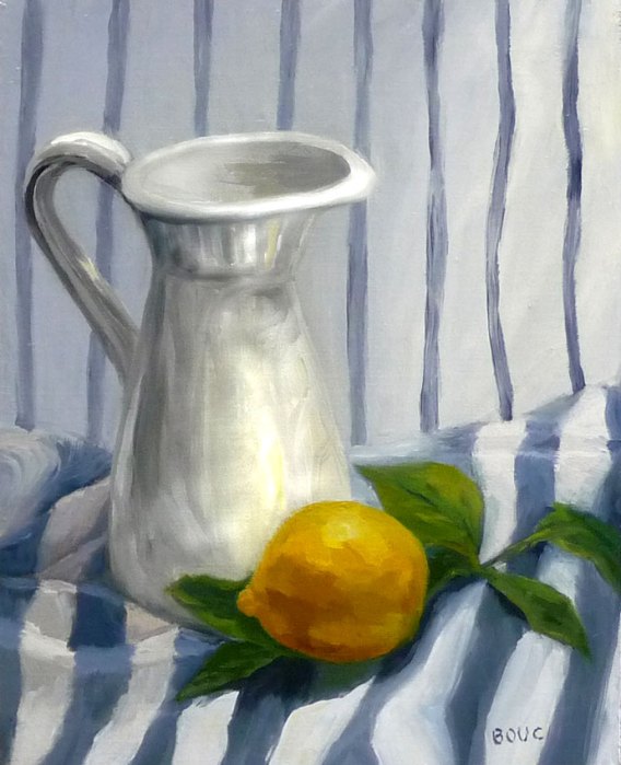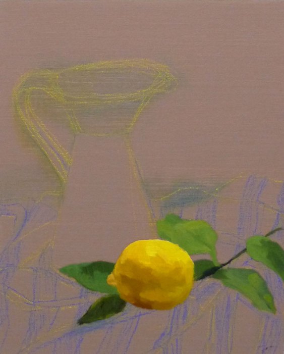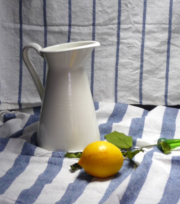
Getting the drawing right before beginning to paint is so important when trying to paint realistically. Although it’s theoretically easier to correct drawing errors with oil paint than watercolor, it’s still a lot less fun than painting with a good drawing. As you can see from the start of this painting below, I hadn’t quite nailed the elipse on the top of the pitcher before I started painting.

I wanted to get started with the painting quickly because I knew the leaves from the lemon tree were going to change wilt, even though I had inserted the stems in a little florist tube with water (and they did!). But by not getting the elipse on the top of the pitcher drawn correctly, I ended up redoing it over and over and finally giving up. I am happy with the way the fabric under the pitcher turned out, as well as the lemon and didn’t have to do any repainting on those areas, although I did change some of the fabric as I painted.

On my next still life, I’m going to sketch the composition on tracing paper first, and then transfer it to the painting panel, rather than trying to sketch it on the panel. Maybe that will make the painting more fun and less of a struggle.
Win some, lose some, learn some, move on.
9 replies on “Stripey Still Life with Lemon: The importance of getting the drawing right first”
Your still life paintings in oil have lovely light! It that the black box stuff that you and Casey both use? The stripes are fabulous!
LikeLike
This is a lovely painting. I always learn so much when I read your blog. Thanks
LikeLike
It might not be exactly “right” but the pitcher opening sort of matches the shape of the lemon so is more pleasing that the original, I think. The objects are connected and engaged with each other.
LikeLike
To me, the elipse is perfectly fine. So often a kind of skewed accuracy is more interesting than plain old precision. (I think this is one of the principles of Hopi art, maybe because their first painting surfaces were rocks.) And the lemon has a very lemony surface–is that cadmium lemon yellow?
But the real biggie of this picture, to me, is the contrasting stripes, with all their confidence–that, and the way the ground pulls the foreground into it. It makes you wonder why more painters don’t try this total ground of stripes.
And two alluring mistakes are avoided. How boring it would be if the stripes were exact, straight, and flat. How tiresome it would be if the pitcher ended up as only a study of painfully accurate reflection.
So–insouciant (like the word) inaccuracies of artifacts, and one highly distinct and accurate natural thing, the lemon. It reverses Stevens’ “Anecdote of the Jar”. It gives dominion to the natural, and distorting instead things made.
LikeLike
Hi Chloe, Thanks once again for another poetically written comment, with wonderful juicy words that set me to thinking. Insouciant lemon, eh? I especially appreciate your use of the word “confident” in relation to the stripes. That was one passage in the painting that I do feel I painted with confidence and it’s interesting it shows. As I got more confused in other areas I became less confident, which also shows. I received your revised digital collage and will eventually post it. Life has been crazy lately (which is why such a late reply!) but hopefully things’ll settle down soon. Jana
LikeLike
Thank you Jana for sharing your Art with us i think you area trukly great artist
LikeLike
This is a painting which I honestly can say is better than the real things put together. The work you put on the vase is great.
LikeLike
Thank you so much for your wonderful, kind words! Jana
LikeLike
This is absolutely charming, Jana. I know what you’re striving for (me too) but don’t underestimate the attraction of a little ‘quirkiness’. And those stripes are masterful.
I had so much fun discussing oil painting with you last time we met – maybe we could talk on the phone once in a while (I’ve got a free line to the US)? Sharing information really moves the leaarning process alon, don`t you think?
LikeLike