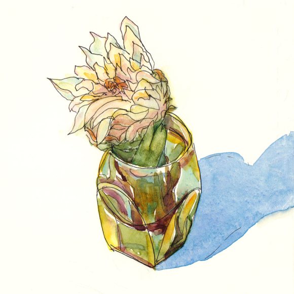
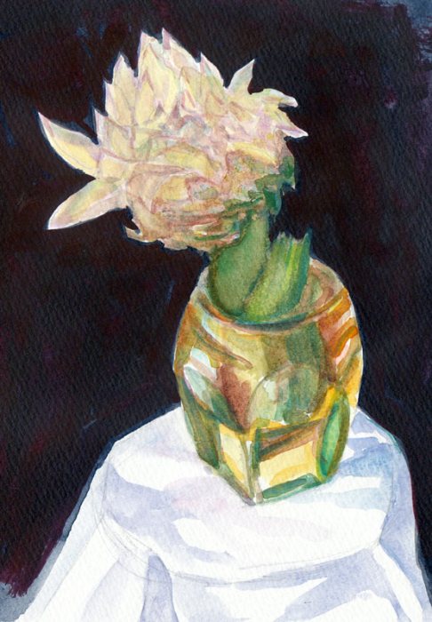
I think the soft, flowery heart inside a prickly artichoke perfectly illustrates my feelings about Valentines Day. I love artichokes and the heart is always the best part, but you have to work to win the right to savor it. I was surprised how soft, gentle and flexible the leaves were when I peeled them off to get to the heart, compared to how tough they are when they’ve been boiled. I’m sure there’s a good analogy there about love and tenderness, but I’ll leave that to the poets.
I first tried to do this painting using a sketchbook I hadn’t tried before: Maruman Art Spiral, that has what looks like cold press watercolor paper in it. It started dissolving when I tried to lift paint or glaze more than one layer. Yuck. I wasn’t at all happy with the first try below and started over.
As I wrote in my last post, the past few weeks have been rough. When I finally got in the studio today. I began by wasting an hour trying to rescue a painting of 3 artichokes I’d started last night and finally decided it was unsalvageable. I felt uninspired, clumsy and like everything I tried to do is crap.
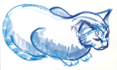
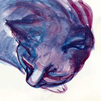
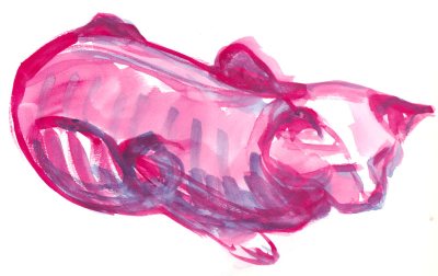
Then my cat jumped on the drawing table to sunbathe under my lamp. I had a brush in my hand, my gouache palette open, a sketchbook I wanted to finish and a willing model. So I did quick kittie sketches with paint, trying to get back in the flow. It helped get the juices flowing again, although my inner critic was still harping at me, telling me these were crap too.
Maybe they are, maybe they aren’t, but they’re bright and colorful and were fun to do, and the stupid sketchbook is filled and on the shelf.


14 replies on “My Prickly (Artichoke) Heart”
Your artichokes AND your cats are wonderful! I always enjoy your work, and I love that any subject is worthy for you. You’re brave. I’ve always been fascinated with your dream images–I never have dreams as vivid as yours–mine are always sort of filmy and diffuse, so I’m not sure I could paint them. Anyway, difficult paper or not, the artichoke images are stunning. Oh–and Happy Valentine’s day!
LikeLike
The first place I ever ate an artichoke was in Berkeley — it was wonderful. Like this painting.
Happy Valentine’s Day. (And the kitties? Lovely.)
LikeLike
LOVE LOVE the watercolor artichoke Jana!!! The glass is beautiful.
LikeLike
These little cats are super cute and I’m glad you took the time out to paint them even when feeling discouraged.
LikeLike
Well I like the cat sketches, especially the top one on the right – your iner critic needs to calm down!
That artichoke is really gorgeous, Jana – glad you’ve come out the slump!
LikeLike
Hi Jana,
I love the artichoke painting, the good paper really makes a difference! And the cat pics are adorable. Thanks for sharing.
-Jane
LikeLike
I love these casual, unstudied little cats, in their fine colors. The charm of sketches and paint. They match up so well, and seem so casually independent.
LikeLike
Well, Dinah never draws US. She says she can’t draw cats. So we have to come and see these!Which, by the way, are pretty darn’ good. And we should know!
pawed: Rusty, Geiger and Sporran
LikeLike
So pretty! What a wonderful melding of colors.
LikeLike
Jana, I just learned a little about pen and ink. My mother-in-law taught me–she is with the decorative artist’s society. We did a “project” where we traced an enlarged photo using graphite paper and then used watercolor pencils to color it in.
Now I want to try pen and ink with my own designs. Is the process basically the same? Do you do a drawing and then outline it in ink and then color it in? What type of pen do you use?
Thanks, Marmalade.
P.S. all your sketches excite me as I try to become an artist, and this one is no exception. My pen and ink project can be found at http://thejellies.wordpress.com/2009/01/19/a-pen-and-ink-project/
LikeLike
Hi Marmalade,
When I do my ink and watercolor sketches I usually draw directly in ink on
watercolor paper without drawing in pencil first and without tracing.
They’re meant to fun and free and I’m not too concerned about getting the
drawing perfectly correct. You might want to check out Danny Gregory’s book,
The Creative License. He advocates for that kind of drawing and it’s a
really fun and inspiring book.
When I do large watercolors that I’m going to spend a lot of time on I’m
more careful about the drawing. Sometimes I do trace an enlarged photo if I
want the painting to be exactly like the photo. Other times I might trace
something critical (like a face that has to be right) and draw the rest
freehand.
My favorite pen, and I’ve tried many, is pretty simple: a Micron Pigma 01.
Sometimes I think it’s fun to draw with a fine point Sharpie too, but you
have to move fast or the ink bleeds.
~Jana
LikeLike
Amazing artwork…
LikeLike
The cat sketches are wonderful, Jana. I really understand your feelings of frustration–I’m sure all of the painters who come to your blog do. One thing I’ve noticed about your oil paintings is that you don’t have the same strong value differences within objects that you do in your watercolors. The artichoke heart is a case in point. Squint at the watercolor version, then squint at the oil version—the leaf grouping in the oil is almost one tone, without the subtle spatial distinctions created by value changes that the watercolor has. The vase in the oil is much less defined than in the watercolor for the same reasons. I wonder if you are overblending your oil paints and maybe relying too much on local color and not enough on tonal shifts. Hope you don’t mind my musings. I’m a big fan of all that you do, as you know!
LikeLike
Laura, THANK YOU so much! You provided the key to the solving the problem with my oils that I was missing.
For some reason value contrast is both the thing that I’m most attracted to and the thing I’m most afraid of, especially in oils. I overcame my fear of making bold dark and light statements in watercolor. I think it’s also easier in watercolor to create a strong contrast with the ability to save whites or even leave the whole background white.
In oils, it’s very easy to lose the original darks as lighter colors encroach on and mix with them. Trying to get them back once they’re lost (at least when working alla prima) is difficult once a lighter color gets mixed into the dark.
I think it’s really important to have a strong value structure in a painting and often begin a painting by doing a value study and sometimes a value underpainting. But I’ve also studied with an impressionist/colorist painter whose teachings are opposite the tonalists, in that she emphasizes that color is more important than value because “If you have the color right, you have the value right.” But before she studied impressionist painting she had a career in design and illustration so her value “chops” were already excellent.
You’ve helped me to see that what I need most right now is to go back to basics and focus on value until I’ve developed the skills to get the value right. Then I can go back to studying color.
I’m always grateful for art advice of any kind and really appreciate receiving it from you, one of my art heroes. Now I’m really excited to get back to the easel. Thanks!
LikeLike