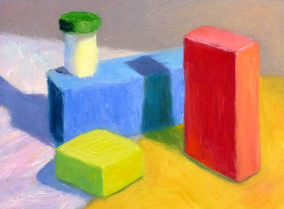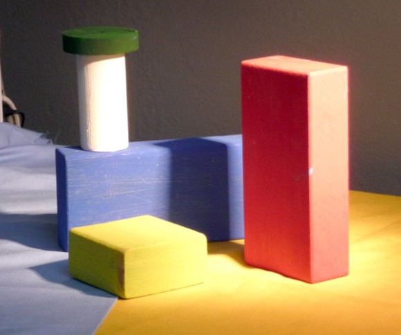

This study was done to practice seeing, mixing and and painting the relationships of color and light on different planes. Theoretically these colored block studies should be done outdoors with natural light, but it was a cold windy day and I wasn’t feeling well (and still don’t—first it was stomach flu and now a cold) and so worked indoors. When I compare this indoor painting to those I did outdoors and posted here, I can see why it’s better to work outdoors.
This practice is based on the work of Henry Hensche. As Professor Sammy Britt says about Hensche on the Hensche Foundation website:
“Charles Hawthorne was the first painter…to put the “Impressionist concept of seeing” into a teaching principle. Hawthorne spent the last fifteen years of his life trying to understand what Monet looked for and how he painted.
Henry Hensche, an assistant to Hawthorne, perfected the concept of seeing and teaching color after Hawthorne’s death in 1930. Mr. Hensche taught and practiced this visual language of color from that first Summer in 1930 until his death in 1992.” [emphasis added]
I’ve studied on and off the past year with Camille Przewodek, a fantastic plein air colorist and former student of Hensche and I think I’m beginning to comprehend the concepts at a basic level (although the study above is a poor representation of that). Another painter who studied with Hensche, John Ebersberger, has created a Hensche Facebook group that is open to the public, for former Hensche students and others who are interested in Hensche’s approach to seeing and painting color relationships. There are wonderful photos posted there of Hensche paintings and paintings by the artists who have carried on his approach to color, and to my mind, have advanced it even further. Their discussions and critiques on the groups discussion board are also quite illuminating.
Painting colored blocks under different light is one of the techniques Hensche used to teach students to see that in every plane change there is also a hue or color change (not just a tone or value change), and how these colors change according to the light key (foggy grey light, bright sunlight, early morning light, afternoon light).
This is not an easy approach and takes years of practice and study, best done with an experienced teacher like Camille Przewodek, John Ebersberger, Carole Gray-Weihman, Dale Axelrod (great links and examples on his website), and others at Atelier aux Couleurs Art Academy who offer workshops locally and internationally. I have found one book, Painting the Impressionist Landscape, that does explains the concepts (although I don’t think that author’s paintings provide stellar examples, especially compared to those listed above).
Even if I never learn to see and paint like they do, I’m sure the concepts I am learning will enrich my painting and it has already changed the way I think about light and color and form.
11 replies on “Still Learning to See Color: Block Study (after Hensche)”
thank you for posting this info. I am going to read about Henry Hensche. These are some of the things i am starting to think about with my own art. plus i am going to look at your blog more when i have some time.
LikeLike
I’m curious now. This is a lovely study! I have found that using only colour for tonal gradations is a more rewarding colour practice than using white or black to lighten and darken.
LikeLike
Thanks Andrea,
If you have a chance, definitely take a look at the photos posted on the Hensche facebook page. You’ll see that my study is a bare beginning and quite pitiful in comparison to the masterful studies posted there.
One thing that these artists say is that if you get the color right, the
value will be right. Unlike the tonalist approach that emphasizes values
first, they think of using color temperature and hue changes to create the
appearance of value changes, rather than just going darker or lighter. They
also believe that every color spot in the painting should be different since
every plane of every object is also different. Part of the challenge of
learning to see this way is to try to stop seeing local color in preference
for the color combined with the effect of the light. So blue may be seen as
pink, yellow as green or vice versa.
Also, like your paintings, the colors used in the initial blocking may be
very different from the final outcome which is modified with another layer
painted over it, so that when bits of the first layer are combined with the
second, optical mixing creates the color that you see when looking at the
painting. I find that part the most challenging and what stopped me from
trying to explore your way of painting — although I love the vibrations you
get it seemed too daunting and like it takes a lot more experience than I
had. At this point it’s enough of a challenge to try to capture what I see!
Jana
LikeLike
I am very interested in the Hensche approach, Monet being one of my very favourite painters and the California Impressionists being among my fave contemporary movements. I was put off a few years ago, however, firstly by coming to it via one of Susan Sarbach’s books – which seemed NOT to practise what it preached in terms of painting actual colours perceived – and then by having someone “explain” the theory to me in extremely elaborate terms which seemed designed to obscure more than to clarify the approach. Studying under someone who studied under Hensche sounds like a wonderful opportunity!
LikeLike
Hi EJ,
I understand what you’re saying. I know that several people in Camille’s class had previously studied with SS and have had to unlearn some things that she teaches that diverge significantly from the original work by Hensche. Camille is always very careful to say that it’s not a “method” with prescribed rules and steps, and she, like I’ve read about Hensche, provides guidance to each student according to where they are in the process and what they need at the time.
While there are overarching principles, the learning seem to be like layers of the onion, as first the blinders are removed (of what we think we know about what we see) and then the thin layers of the onion peel away one at a time with new insights arriving as each layer is removed.
Even though I’m still a complete fumbler I’m extremely excited about what I learn each time I have the opportunity to watch Camille demonstrate and get her guidance on my painting. Her husband, Dale Axelrod also studied with Hensche for 10 years and together they make a formidable teaching team!
LikeLike
Thank you for this post, Jana – I learned so much! All those gorgeous colors have lifted my spirits on a depressing winter day!
LikeLike
Good for you, Jana! This way of looking at things really jogged me out of my comfort zone, but helped a LOT. Check out Lois Griffel’s videos (maybe DVD by now) Painting the Impressionist Landscape, which does an excellent job of getting across the way of seeing. I’ll check back to see what you do with all this…
LikeLike
What a great post with lots of info, thank you! I’m reading the book by Lois Griffell and I agree with you, I wish there were better examples in the book. But I will press on and try to figure it all out!
Joan
LikeLike
It is a challenging process but Lois does make it a little more clear than some teachers I’ve studied with. Jana
LikeLike
Nice work! I have a silly question. Where did you get your geometric shapes? I can’t find and premade and I’m trying to avoid making them myself.
Thanks for the advice!
Melody
LikeLike
Hi Melody, I went to a used toy store and bought two bags of children’s wood blocks (small and medium sized). One set was already colored and the other set was natural wood. I bought the cheapest matt acrylics I could find at the art supply store and painted those with a variety of colors. I picked up a couple of solid squishy rubber balls at a health fair (they’re for squeezing) and cut off a bit of the bottom so it doesn’t roll. Art supply and craft stores also usually have styrofoam shapes such as balls, cones, rectangles etc. They’re white but could be painted. Cones are interesting challenges so one of these days I’ll probably get a cone shape too. I hope that helps! Jana
LikeLike