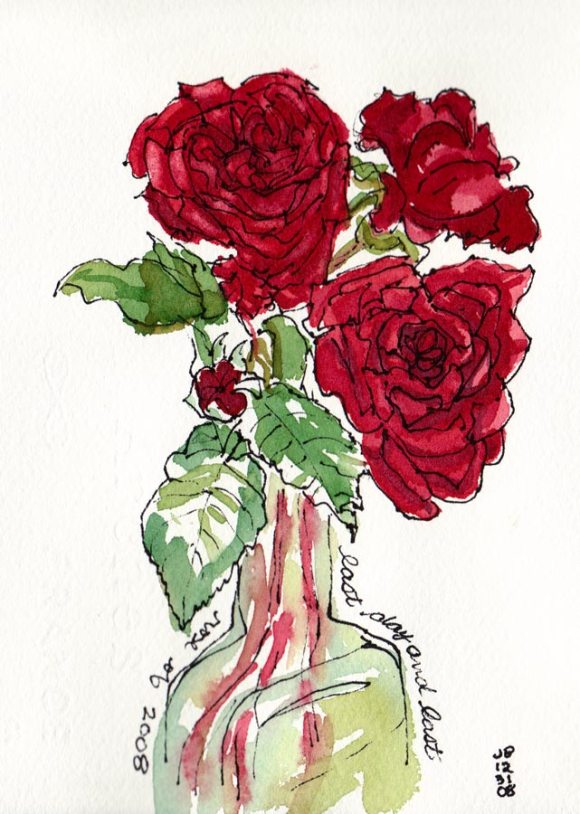
My next door neighbors were pruning their roses for winter so I asked them to save some for me to draw (they were going to throw the still perky roses in the recycling bin). I started by trying to paint them in oils but was having a terrible time mixing the right colors. I scraped off the paint and went to bed, planning to try again the next day.
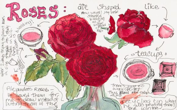
When the cats knocked the vase over during the night I was actually relieved, thinking the roses would be too funky to paint since all the water was on the floor, not in the vase. But these were some tenacious roses, and were still fine so I decided to try sketching them in watercolor (above and below). I also consulted one of my books on flower painting that said roses were shaped like teacups, so I added a few of those tilted at the same angles to the sketch to help me understand their shape better better.

I’d just finished the sketch (above) and was writing about how hard it is to mix the highlight color of “blood red” roses in oil paint. At that very moment, my nose started bleeding for no reason at all and it dripped onto my sketchbook! Now I feel like a real Avant-garde artiste, painting in blood!
P.S. A little pinching of the nose and it stopped.

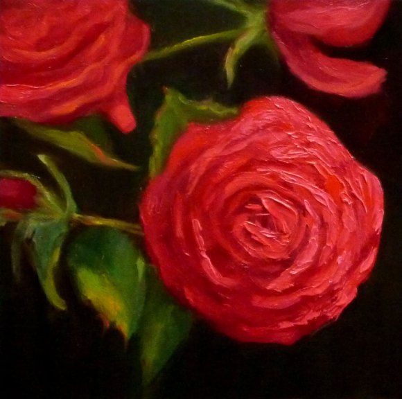
Mixing a light red color in oil paints
It’s hard to mix a warm, light red in oil paint because when you add white to red oil paint, it makes a cool pink. This is because all white oil paint is cool (meaning it tends more towards a blue than a warm color like orange or red). But the color of these roses in bright, warm light was a hot pink. It’s easier to get a warm, light red in watercolor because you use the “white” of the watercolor paper to show through and “lighten” the red, not white paint.
To get help with the dilemma I sent an email to Diane Mize at Empty Easel since she and I had recently corresponded about color charts and she’d written an excellent article on Empty Easel about how to mix correct color in oils. She validated that mixing a light red is challenging and offered some good suggestions, including using Naphthol Red, which is a more intense red than the cadmiums (which quickly lose strength in white).
I tried making the lighter areas of the rose thicker, using a palette knife, since those raised areas will catch the light and reflect it making it appear lighter. I also intended to make the dark areas on the roses more neutral and cooler, so that by comparison the warm light area would look even more brilliant. But the roses finally died and that put an end to the painting. My favorite part of this painting are the leaves at the bottom left.
17 replies on “Red Roses Painted with Watercolor, Oil and Blood (!?!)”
Wow! those are niced and red. I always enjoy reading your blog, and I like your header better than the last one with squares.
Did you try mixing some buff color with the red, instead of white? With acrylics that works better.
Good luck with your goals for the year.
Merle
LikeLike
Thanks Merle. I did try a buff color (Naples Yellow Light), but when I read the label it was just yellows ochre mixed with white so it didn’t work too well. By the way, the former header with the squares was actually a section of my oil painting color charts but I realized you couldn’t really tell that’s what they were. It looked too graphic, I think. Thanks for taking the time to leave a suggestion. I appreciate it! Jana
LikeLike
I like the leaves at the bottom left, too Jana. The colors are lovely and your information is so helpful. I haven’t tried Napthol Red but must do so. What brand? Daniel Smith?
annie
LikeLike
What a bludy funny posting Jana! And those scary stems on the roses! I love your next sketch though, the doodling and thinking about the roses. You are so energetic. I haven’t done any drawing or picture making for several days – I overdid it with that garden in Greendale!
w.
LikeLike
Jana: Know what you mean about light red in oils, I struggled with that one for my poinsettia paintings recently. I found Cadmium Scarlet or Scarlet Lake work well for those lights, even though they are orangey out of the tube. I think your rose has good definition. But like Wendy says, I really like the playful sketching with the teacups. That’s a fun one.
Nel
LikeLike
Hi Nel, I actually studied your poinsettia painting when I was having trouble to see how you tackled that problem. Thanks for the suggestion of using Scarlet. I was looking at color charts and wondered whether that would be a good option. Jana
LikeLike
Jana, you’ve got it! A wonderful little oil painting with great colour and! I specifically like the kind of crop you used for this one!
What a coincidence – LOL – see what the last post on my “Blooms and Blossoms” blog is: “bloody barberries…” – funny isn’t it?
Keep it up!
LikeLike
Lovely paintings Jana
Sounds to me like your nose is coming out in sympathy with the colour mixing problems and wants to get in on the act! 🙂
How about if you warmed your white first and then mixed that combination with your red?
LikeLike
The red in the watercolor roses is gorgeous! A beautful little painting. I still have a lot of trouble with mixing reds with watercolor paints.
LikeLike
Hi Jana,
regarding the mixing of colours I have a good tip for you:
when I have problems mixing the right colours or if I simply want to know what a certain colour consists of I use photoshop. I enlarge a certain colour field till the maximum. From the pixels you can see quite easily how a colour is composed of and how the eye perceives that kind of colour. It really works!
Greetings, Petra
LikeLike
I agree the leaves on the bottom left of your painting are beautiful, Jana but I really like the whole picture very much. And totally entertained by quest for the right red and all the tips it attracted.
LikeLike
I love your story!! Thanks for your congrats on my museum show from a mutual wild child at heart!
LikeLike
You’ve played around nicely with colours here Jana…they all have such nice atmosphere and your oil especially is so dramatic, rich.
Ronell
LikeLike
What an educational,Fun post. I have never tried oils and suspect I should stay away 🙂 Each Rose rendition is fabulous in its own right and although it sounds horrific to get the color right You DID, in each post!! and isn’t it ironic, the blood stains are less red, actually a bit salmon?(at least on my monitor)
And Happy New Year, I looked forward to every post last year and will for the new year!
LikeLike
Thanks Sandy. I had the same thought about the color of blood, but realized
“blood red” refers to that beautiful brilliant color of fresh blood (ick,
sounds gruesome, but I’ve seen quite a bit of it lately — I’m still having
stupid nosebleeds, have had them winters since I was a kid). Jana
LikeLike
great post! love your painting as well as the sketchbook page:)
Trish
p.s. I tried another watercolor this evening-not very happy with it, but I am happy with just the fact that I’m trying!!
LikeLike
I have tons of roses in my garden but have found the reds had to paint. I will try agin usig our thoughts.
LikeLike