
Painting blocks to use in light and color-study still-life as explained in this previous post. (Newly gessoed panels drying in little rack behind the blocks).
After jumping head first (or was it feet first?) into oil painting, and then flailing about, trying to find my way, I realized it was time to go back to basics. Just as with writing or speaking, a basic vocabulary is essential to expressing oneself.
But I was trying speak “oils” using the vocabulary of color I’d learned with watercolor, assuming that Red is Red, whether it’s watercolor or oils. Unfortunately, I’m finding that’s like assuming if you can speak English you can speak French since they use the same alphabet.
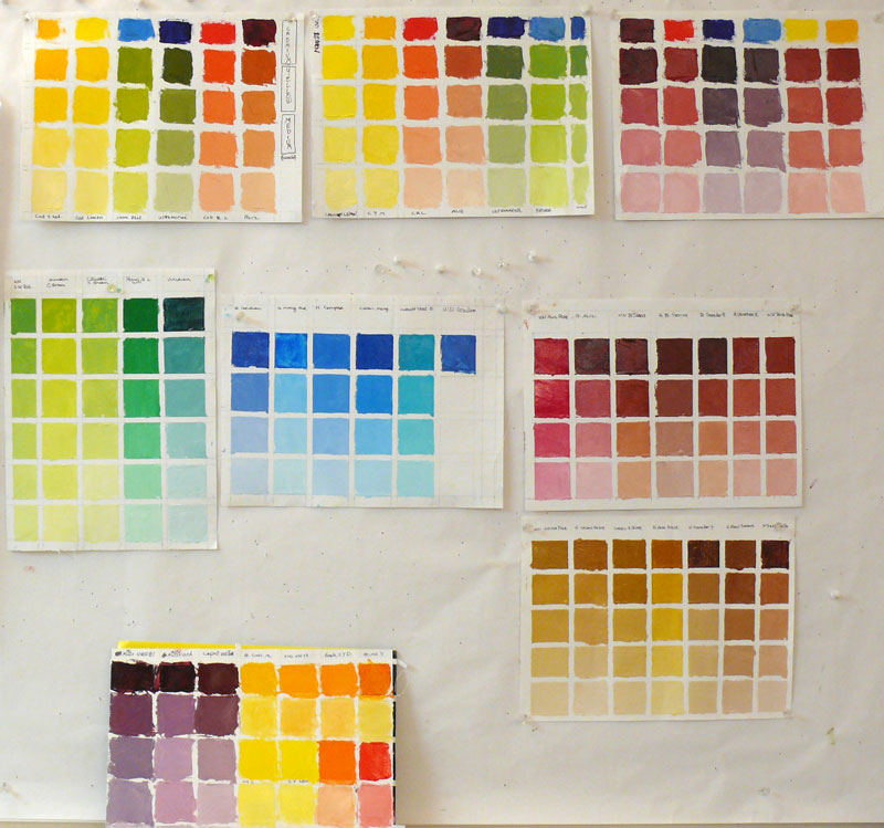
Oil painting tests of different brands of color to choose my basic palette
(Click Images To Enlarge)
When I first started painting with watercolor, I made dozens of color charts, testing the various pigments to learn about their natures, alone and mixed with other colors. In watercolor this is really essential since there are so many characteristics that affect the flow of the paint: whether it charges into neighboring paint or resists it; whether it’s opaque or transparent; sedimentary (leaving little spots of sediment), staining or lifts easily, how it mixes with other colors and more.
I hadn’t done this with oil painting. But watching Camille Przedowek demonstrate a couple of weeks ago, I was struck by her huge “vocabulary” of color. She was quickly mixing up and painting with colors I couldn’t even name! I realized my oil painting color vocabulary is about that of a 4-year old from a foreign country.
(CLICK “Continue Reading” to read and see the rest…)
Camille recommended making color charts, using the colors from my palette, mixing each of them with each other (more explanation at the end below). But before I could do that I needed to narrow the selection of colors and brands on my standard palette to speed up charting and learning the mixing qualities of the colors.
Camille suggested a list of Winsor & Newton colors. I’d been using mostly Gamblin paints. To decide which colors to keep on my palette I made some charts to compare the different colors and brands. I was surprised at the extent of some of the differences.
For one thing, the actual pigments used by different paint companies for the identically-named colors are often different. I know from my watercolor experience that pigments matter so I always look at which pigments paints are made from. Pigments are specified on the tubes with both their chemical names and their pigment index numbers (e.g. “Quinacdridone Violet”= PV 19 (Pigment Violet 19).

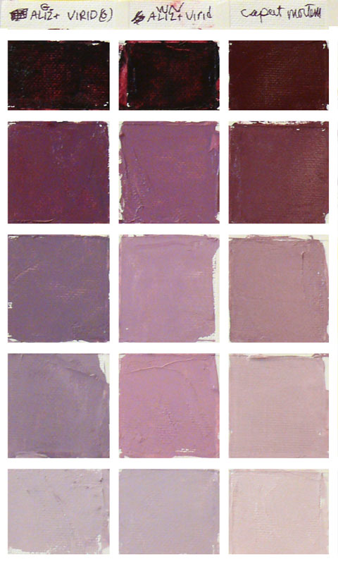
Alizarin Crimson & Burnt Sienna tests
Click on the color charts above and you’ll see a good example of these differences. The two colors at the top left of the first chart are both called Permanent Alizarin, substitutes for true Alizarin Crimson which is not a permanent color and is rarely used anymore. I added white in increasing amounts going down each column.
The square on the left is Winsor & Newton’s Permanent Alizarin Crimson, made from Anthroquinine, whose chemical name is Pigment Red 177 (or PR 177). You can see how bright and vibrant a color it is. On its right is Gamblin’s version, Alizarin Permanent, made from Quinacridone Red B, Perylene Red, and Ultramarine Blue (Pigment Violet 19, Pigment Red 149, Pigment Blue 29).
Gamblin was trying make a color as much like the original Alizarin as possible, but with all those different pigments it seems much duller when blended with white or with Viridian, as in the next chart on the right above. On that chart I mixed Viridian equally with those two Alizarins and then added white to those mixtures.
The same seems to be true of the Burnt Siennas by Winsor & Newton and Gamblin in the middle of the top left chart. Winsor Newton uses Synthetic Iron Oxide, PR 101. It’s bright and transparent. Gamblin uses Calcined Natural Iron Oxide, Pigment Brown 7) which is semi-transparent and a much duller color.
On the charts below I compared Yellow Ochres and other earth colors. I compared similar blues (many with misleading names, such as Manganese Blue which is actually Phthalocyanine blue mixed with white since Manganese Blue paint is no longer made (due to the high toxicity involved in the manufacturing process.) Except for the the more expensive, single pigment Cerulean, all of the blues in the chart are actually made from Phthalo blue dolled up to look like Cerulean or the non-existent Manganese.


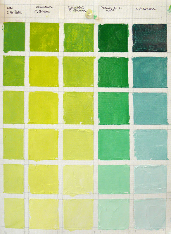
The greens above are all manufactured from a combination of yellow and blue pigments except for Viridian which is a single pigment, low intensity, transparent green.
I’ve narrowed down my pigment choices, switching to some of the Winsor Newton colors from Gamblin and now I’m starting to working on the actual color combining charts. I’ve already had some really exciting “Aha!” moments seeing the surprising things that some colors do when mixed together.
I’m hoping that once I’m more fluent in the color language of oils I can get back to expressing myself in actual paintings without so much stuttering and stumbling and blurting of wrong “words.”

7 replies on “Back to Basics – Color Vocabulary”
Very interesting, Jana … and so much to learn!
LikeLike
Good evening!
I have read your post
janabouc.wordpress.com/2007/03/16/an-artful-life/ about your friend Barbara.
I would like to reach her in order to send an invitation for an International Competition for creamic whistles.
My mail is concettafesta(at)gmail.com
http://www.geniuslocimatera.blogspot.com
Regards
Tina.
LikeLike
I think I spent over 300 hours making color charts. I was hoping I could use them as reference but could never find a match.
LikeLike
Jana, I have given up entirely on naming mixes or relying on specific names because the brands are incredibly different. I no longer buy my colours for their names but I grab the ones I think are the best for my purposes. I mix colours on my porcellane palette (using acrylics) and then let them dry on paper, sometimes I am using retarder and mixing directly on the canvas when I can work quickly.
Acrylics are looking so different between all states of wet to dry that it is really useless to rely on mixing formulas. I consider this as a kind of necessary learning experience for absolute beginners but a waste of time when you are painting regularly. I also appreciate surprises – LOL! (coming from silk painting)
Cordially, Petra
LikeLike
there´s much to learn! Interesting post!
LikeLike
I did these same exercises from Lee Boynton’s Painting the Impressionist Watercolor and they taught me so much about color mixing. I really become much more comfortable and knowledgeable about how watercolors interact and the subtle differences one hue can make in a palette.
This is really true: I did these exercises on two large sheets of watercolor paper taped together and had them sitting on the easel in my studio. I went out-of-town for three days and my black lab was so upset I was gone she ate half of the paper! I thought she might get sick from the lead in the paint, but she was fine.
I get to do half the color mixing all over again!
LikeLike
Hi Jana, I’m learning a lot just from reading, thank you :o)
LikeLike